Email designers cope with constantly changing standards across web and mobile devices, grappling with different resolutions, screen dimensions, supported fonts, and more.
On top of that, with over half of email campaigns opened on mobile devices and four out of ten emails now opened through mobile applications, it becomes increasingly important to design your messages for an optimal mobile experience. Your emails now need to be as viewable on mobile as they are on legacy platforms such as Gmail. That’s where responsive design comes in.
Table of Contents:
- Why is Responsive Email Design Important?
- What Does Responsive Email Design Look Like?
- Types of Mobile Email Design Approaches
- 5 Tips for Designing Responsive Emails
- Resources to Help Get Started With Designing Responsive Emails
What is Responsive Design?
In 2010, Ethan Marcotte popularized the concept of responsive web design, or the practice of making web content adaptable and engaging across different devices and screen sizes. This practice arose to better meet consumers’ growing expectations around functional and engaging web experiences.
Responsive web design involves the use of fluid grids, media queries, and flexible images. These elements became common practice for web design, and now these CSS elements are also supported by a variety of email clients.
The principle of responsive design is easily transferable to email design and whether or not designers apply it can greatly affect the success of their email campaigns.
Responsive design is an approach to develop and design for the wide variety of clients you want to send emails to. A responsive design adapts to users’ behavior, screen size, platform and orientation.
A key objective of responsive email design is to ensure that your emails are rendered correctly across both mobile and desktop.
To do so, designers aim to embed standards-based technologies into their designs.
The Importance of Responsive Email Design
Achieve Maximum Value
Email is an extremely valuable channel that offers a high potential for profits. Beyond that, with users shifting their attention to mobile experiences, it’s important that your emails render well across both mobile and desktop email clients.
Consider the following statistics:
- Mobile clients account for 41.6 percent of email opens, according to Litmus
- Subscribers first open their emails on mobile 25.6% of the time
- Almost 70% of subscribers view their promotional messages on a smartphone
- Email provides an average ROI of $42 for every dollar spent in this channel
Increase Engagement
A key reason you’ll want to use responsive email design is in to increase your subscribers’ engagement and satisfaction with your email program. With more visually pleasing layouts and image rendering, your subscribers are more likely to open and engage with your content.
Improve UX
Optimizing your user experience across mobile and desktop is critical for your customers. If your email design isn’t adapted well for mobile viewing, your subscribers will likely become frustrated. No one likes to strain their eyes just to decipher your latest bagel promotion. If your buttons are glitchy, your text is unreadable, or your image sizes are out of proportion, users might just unsubscribe from your list. Think about making your message both easy and engaging to view and digest.
Looking for a full list of email optimization tactics? Our guide to email campaign performance includes everything from optimizing email for mobile to examples of high-performing email copy.
A Responsive Email Design Example
By viewing an email on both desktop and mobile platforms, you can observe how elements such as text, images, buttons, and layout structure adjust and reflow to fit the smaller screen dimensions of a mobile device. This comparison allows you to identify any discrepancies or inconsistencies in the email's appearance across different devices and identify areas where the responsive design may need improvement.
Additionally, comparing emails on both desktop and mobile devices helps you understand the user experience from different perspectives and ensure that your email campaigns are optimized for readability, usability, and engagement across all devices and screen sizes.
Looking to optimize your email content? Our guide to structuring captivating marketing emails has what you need!
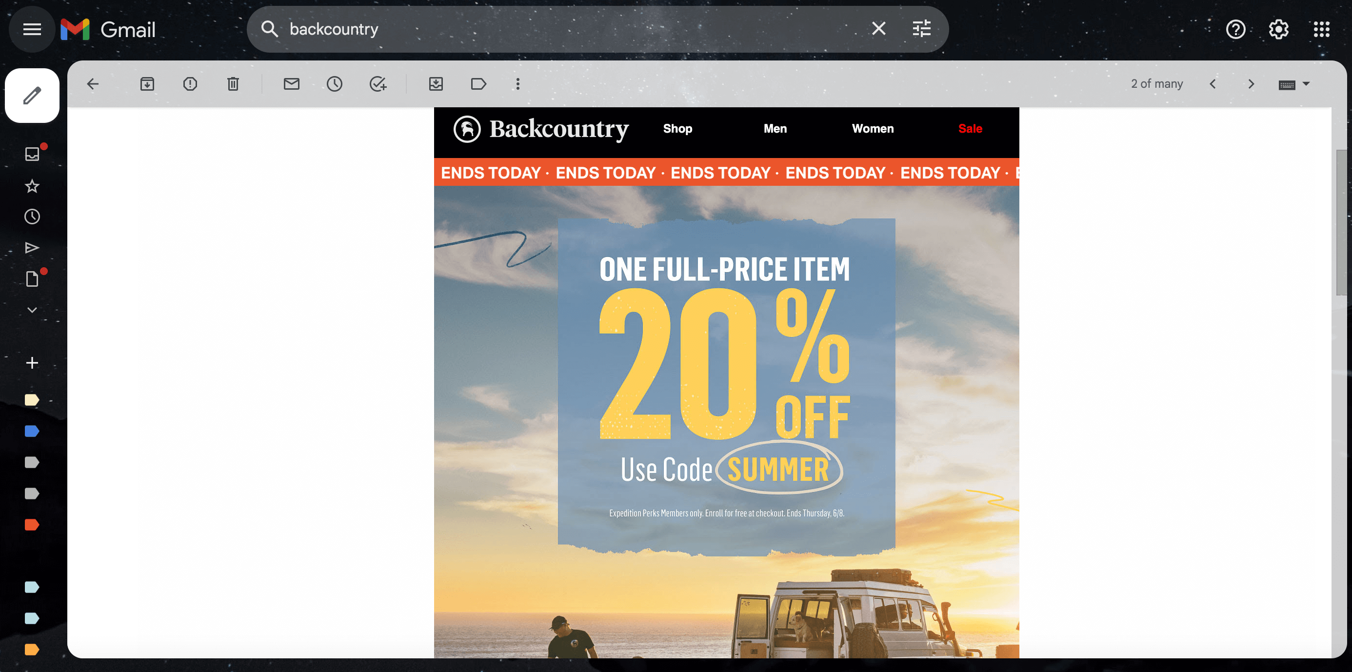
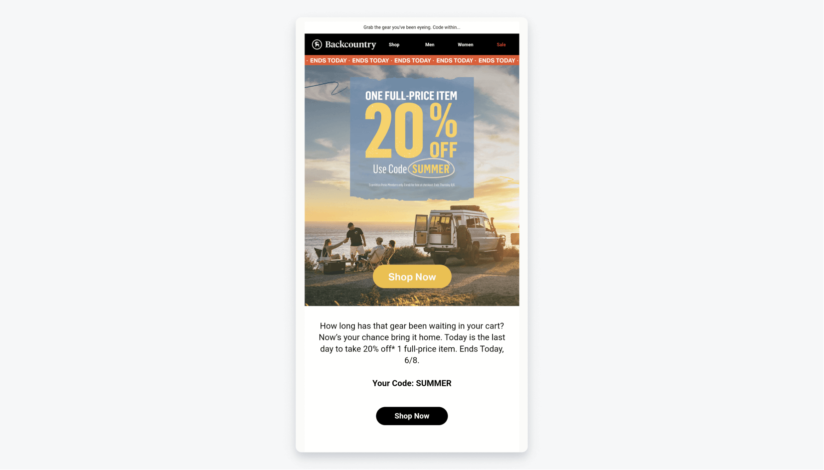
This example from Backcountry illustrates how elements of your email should automatically adjust, from a web browser (above) to fit a smaller screen (below). The header image remains proportional, text is centered, and the CTA is prominently displayed.
Interested in going a step further? Optimizing your email for dark mode enhances the user experience (and reduces eye strain) for this trending mobile user preference.
Types of Mobile Email Design Approaches
Fluid, Scalable, and Responsive Email Design
What are the options you have when it comes to your email design? The three main email design frameworks you’ll commonly hear about are fluid, scalable, and responsive email design.
Scalable Email Design
Scalable email design — or mobile-friendly, mobile-first, or agnostic design— refers to a design approach that makes emails easily readable and surprise, surprise—scalable!— across mobile and desktop experiences. A scalable design approach is less sophisticated than a fluid or responsive email design approach because it doesn’t require any code.
Typically, scalable designs will use a simple layout with a single column for all text sizes, clickable CTA buttons, big text, and information on the left side. Scalable designs are simpler to implement than fluid and responsive designs because they don’t require the adjustment of image or table width between devices, a process that relies on CSS media queries.
Nonetheless, scalable designs give users a similar viewing experience across web and mobile devices without putting extra strain on your design and marketing teams.
Fluid Email Design
Similar to scalable designs, fluid email designs maintain a similar layout from one device to the next, but their elements also fluidly shift to fill in the vacant spaces in your emails.
To achieve this effect, these types of emails use percentage-based sizing to automatically shift table and image widths to accommodate every device’s screen size. Fluid designs are visually appealing because the content automatically flows to fill empty space in an email. For this reason, fluid email designs work best for emails that include a high volume of text. This approach requires the use of CCS media queries.
Responsive Email Design
In contrast to fluid and scalable design, responsive design involves a more advanced technical approach. The end result is an email whose elements “magically” shift and may include or omit certain elements based on the device being targeted.
Let’s get into some basic tips for designing a responsive email!
5 Tips for Designing Responsive Emails
1. Evaluate the Performance of your Current Email Design Approach
Before you commit to this design approach, you should benchmark the success of your current email strategy before putting time into implementing responsive design.
What percentage of your subscribers are engaging with your emails on a mobile device? (Note that open rates are no longer an accurate email metric as of iOS 15.) How have your email KPI’s changed over time? How is your email deliverability?
*You’ll also want to keep in mind that to create responsive emails, you’ll need support from at least one team member who understands how to implement media queries, a concept we’ll get into shortly.
2. Know What You Can Achieve
You have a lot of creative freedom when it comes to deciding how you want your emails to render across devices. You might decide to alter the layout of your desktop email by reducing columns and increasing button sizes on its mobile counterpart. Doing so can make your email more readable and clickable!
Here are some things you can do with responsive design:
- Modify or hide content
- Include padding
- Alter colors and layout
- Increase font size
- Change layout
- Scale graphics
3. Implement Media Queries
Responsive emails leverage media queries to alter emails’ layout, text size, images, buttons, and the inclusion or exclusion of content across devices.
A CSS media query, or @media, is a group of styles that act as conditional rules for how emails render across devices. By embedding media queries in CSS, designers can introduce new layouts for each resolution range, which can change how the layout appears on different devices, for example.
Media queries are almost like magic! They can determine a device's screen size and deploy different sets of rules accordingly. Deploying media queries can be straightforward, or quite complex, depending on the use case.
@media only screen and (max-width: 620px) {
  .btn-primary {
    width: 100% !important;
  }
}
4. Consider the Email Clients that Support Media Queries
Before implementing responsive email design, you should evaluate the platforms where your audience is opening your brand’s emails. Knowing what email readers your subscribers are using to access your content with will allow you to adapt your design approach accordingly. While many email clients support media queries, others still don’t. That’s why it’s important to stay up-to-date both on what platforms support media queries and understand the distribution of your subscribers across these platforms.
Media queries are triggered by the viewport size of the device in question. Viewport dimensions can vary widely based on screen resolution, device-pixel ratio, and phone screen size.
Here are some examples of some common email clients and applications and whether or not they support media queries.
Mobile Email Clients
Yes:
- ✅ Android 4.4
- ✅ Android Gmail app
- ✅ iOS native
- ✅ Inbox by Gmail on Android and iOS
- ✅ Outlook on Android and iOS
- ✅ Samsung Mail on Android
- ✅ Yahoo! Mail app on Android and iOS
No:
- 🚫 Android Gmail app IMAP
Desktop Email Clients
Yes:
- ✅ Apple Mail 10
- ✅ Outlook 2000-03
- ✅ Outlook for Mac
- ✅ Thunderbird
No:
- 🚫 Outlook 2007-16
- 🚫 Windows 10 Mail
Webmail Clients
Yes:
- ✅ Gmail
- ✅ GMX.de
- ✅ Inbox by Gmail
- ✅ Libero
- ✅ SFR.fr
- ✅ Web.de
- ✅ Yahoo! Mail
No:
- 🚫 AOL Mail
- 🚫 G Suite
- 🚫 Office 365
- 🚫 Orange.fr
- 🚫 Outlook.com
- 🚫 T-online.de
5. Consider your Email Elements
Images
Generally speaking, you may choose for your images to render differently across mobile and desktop clients. For example, you may choose to make your images bigger on your mobile emails.
@media only screen and (max-width: 620px) {
  .img-responsive {
    height: auto !important;
    max-width: 100% !important;
    width: auto !important;
  }
}
To optimize for high-resolution screens, make sure you save images at twice the size you hope to display them at. You should also make sure to set image height and width to avoid your images breaking in Outlook. Don’t forget to compress your images to reduce file size.
Layout
For best results, stick to a single-column layout, which is a simpler choice than adding multiple columns. Single column layouts around 600 pixels wide are often most readable for mobile devices. However, if you do choose multiple columns, you might want to try a hybrid design approach. These multi-column layouts are more difficult to implement for Outlook and mobile Gmail apps.
You should also remember to change the target area of your links and buttons in creating a responsive email. Failing to do so can lead to a displeasing user experience, with tiny links everywhere in your email.
@media only screen and (max-width: 620px) {
  .row .col {
    max-width: none !important;
    width: 100% !important;
  }
}
Content
You may also decide to hide certain email content on mobile. In thinking this through, you should evaluate what elements are most important to the message you’re trying to convey and what’s most reflective of your brand. Generally, you’ll want to put your most compelling design elements first.
@media only screen and (max-width: 620px) {
  .desktop-only {
    display: none !important;
  }
}
Resources to Help Get Started With Designing Responsive Emails
If you are looking to start designing responsive emails within OneSignal's HTML editor, check out our responsive email design step-by-step guide for details.
Email clients can be unreliable, and many still remove styles that aren't inline. Therefore, it's crucial to inline your CSS before sending to avoid the risk of your transactional emails or marketing campaigns malfunctioning. This responsive email CSS inliner can help!
Check out Really Good Emails to explore pre-made responsive email templates.
Get Started with OneSignal
OneSignal is designed to help you send messages and seamlessly manage your user communication across a variety of channels, including email, mobile push notifications, web push notifications, bulk SMS, and in-app messaging. Our platform is quick to set up and makes it easy to send eye-catching emails without doing any development work. If you don't have a OneSignal account, you can create one for free. Don't take our word for it — simply sign up and see for yourself!
Create a Free Account