In an age where we essentially carry a computer (sometimes multiple) in our pockets everywhere we go, it’s no longer enough to build a business strictly around those anchored at their desk.
Mobile accounts for nearly 60% of all web traffic worldwide.
The decision of where to target your marketing efforts will ultimately dictate how those marketing efforts take shape. Your product’s UI and UX design will depend on your device priority, just as your marketing strategy will be shaped by who you’re targeting and where they are in their busy days.
In the launching process of “Ready, Aim, Fire,” we’re honing in on that pivotal second step and exploring what it means to adopt a mobile-first approach for your business.
What is a Mobile-First Approach and Why Is It Important?
A mobile-first approach means tailoring your business to prioritize mobile users first. To be more exact, mobile-first businesses cater predominantly to mobile app (and mobile web) capabilities, rather than the traditional desktop experience.
This approach leverages concise content and design to harmonize with natural user behavior across all devices. In this way, adopting a mobile-first strategy effectively makes your business a part of your users’ lives rather than something they only engage with when they’re near a computer.
21st-century technology is built to be used on the go and businesses are now set up to do the same.
What is a Mobile-First Website?
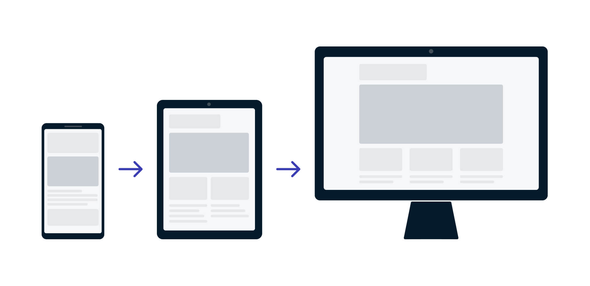
A mobile-first website is not just a website built to work on mobile devices (known as responsive design), but a website designed for mobile devices. A mobile website needs to be ready to go anytime, anyplace, anywhere.
Key features of a mobile-first design:
- Clickability. Buttons, hyperlinks, and menus are bold, easy to read, and navigable with the swipe of a thumb.
- Streamlined content and simplified elements. Not only does a mobile-first website intelligently sculpt relevant information for smaller screens, but its content is optimized for fast page loading times.
- Stop the scroll. Smartphone users do not want to be constantly opening new tabs on their devices to find the information they’re looking for. A mobile-first website will implement a menu UI that shows users exactly where they’ll be navigating when they tap.
- Responsive design. Flexible layouts that seamlessly adapt to fit whichever resolution, orientation, or device someone is using.
SEO Benefits of a Mobile-First Approach
Don’t forget, the mobile-first mindset is not just about the user experience, but also can benefit your SEO marketing. In today’s mobile marketplace, your SEO strategy directly hinges on your site’s ability to function on multiple devices. Fast loading times and Google’s tendency to prioritize mobile-optimized content mean that mobile-first websites are much more likely to be discovered in organic search results.
As of March 2020, Google announced that they were switching to a mobile-first indexing system, after finding that 70% of all websites are ready for mobile SEO indexing. According to Google, they will “still occasionally crawl with the traditional desktop Googlebot, but most crawling for Search will be done with our mobile smartphone user-agent.”
How Are Mobile Apps Considered Mobile-First Companies?
Over the past 10 years, social media platforms like Instagram, Twitter, and TikTok have all but perfected the art of building mobile-first platforms. Regardless of your platform or product, it benefits every business to study the patterns of the mobile titans who seeded the field for today’s mobile-first landscape.
More than anything, the modern user experience is built around accessibility and convenience. Ask yourself, “Can someone engage with my business ‘in between the cracks’ of their day-to-day lives (ie. Waiting for their coffee)?
What Does Mobile-First Marketing Entail?
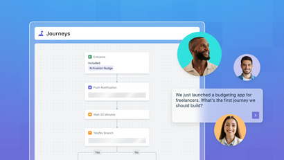
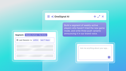
Mobile-first marketing means prioritizing mobile users and tailoring marketing content, communication channels, and strategies to mobile devices. Mobile marketing content should be differentiated from desktop messaging and specifically designed for smaller screens. Additionally, mobile-first marketing campaigns should heavily leverage mobile communication channels like web push notifications for mobile and in-app messages to capture user attention when it's most likely to convert to a sale.
As of 2021, the mobile-commerce market comprises nearly 73% of total eCommerce.
Mobile web push technology is still growing as well. Apple recently released support for web push on iOS and iPadOS 16.4+ to help companies reach new iOS audiences and engage with users in real-time.
The Difference Between Mobile-First and Desktop-First Approaches
Although a mobile-first approach is widely accepted as the future of commerce, it is not necessarily a “one size fits all” solution. Below are the key differences between desktop and mobile-first development approaches.
Desktop-First Benefits and Drawbacks:
+ The ability to design more broadly, with the inclusion of several features
+ More creative freedom in regard to long-form content layouts and brand expression
+ Desktop users generally have more time to browse, a faster/more stable internet connection, and more intent when engaging with brands
- More technically intensive coding and potential areas for UX to suffer
- Does not cater to the majority of consumers who engage primarily on mobile devices
Mobile-First Benefits and Drawbacks
+ Being easily accessible across all devices makes your product or service widely accessible and broaden’s brand reach
+ Simplified mobile websites decrease the likelihood of UX-damaging bugs
+ Great potential for SEO performance due to faster load times and Google’s priority crawling of mobile-friendly pages
- Must have strict priorities in place for which select features to optimize for mobile, before expanding functionality on desktop
- A more restrictive space when it comes to long-form content and creative design
Of course, deciding which approach is right for your business is made easier if your product is a mobile app. If you operate a website, or a website and a mobile app, then choosing how to structure your marketing and engagement strategy can take a bit more thought. The bottom line is, if the majority of your traffic is expected to come from mobile, then you want to have a mobile-first strategy for engagement, including in-app messaging, push notifications, mobile analytics, and the ability to personalize messaging based on real-time user behavior.
The Future is Mobile
The number of worldwide app downloads has grown by more than 80% since 2016. That number is expected to take a nearly 30% jump, come 2026.
The rise of mobile apps (and mobile app monetization) will continue to illustrate a change in the user experience. Increased link sharing between smartphones and a desire for a unified content experience across all devices make a mobile-first marketing strategy arguably the most important factor in the 21st-century race for user attention.
Getting The Most Out of Mobile
With the world’s growing reliance on mobile apps and advances in technology replacing tower PCs with pocket PCs, a mobile-first marketing strategy is more of a necessity than a luxury.
Whether you are marketing a mobile app or a mobile-optimized website, leveraging today’s mobile-friendly features is a fantastic way to unify your user experience more unified and seamless.
Learn more about mobile-first marketing capabilities and why millions of marketers are turning to OneSignal for multichannel messaging and seamless developer integration. Better yet, create a free account and see for yourself first hand!