It’s been nearly four years since Apple announced mobile Dark Mode with iOS 13 and kicked off a trend that today has every mobile user asking the same question about their digital experience: “Does it come in black?”
Dark mode has become so accessible that many, if not most users, prefer to scroll, tap, and read in the shadowy comfort of a digital user interface (UI) that looks sophisticated and doesn’t feel like having a six-inch staring contest with the sun. While comprehensive Dark Mode adoption statistics are few and far between, Android Authority published a study in 2020 revealing that a stunning 81.9% of participants use Dark Mode on their phones, in apps, and wherever else it’s available.
Design fads come and go, but the ability of mobile developers and marketers to adapt accordingly to those fads is what creates higher user satisfaction and ultimately cements long-term mobile retention.
If you’re attempting to build Dark Mode functionality into your email development, this guide will help you implement code, avoid common limitations, and optimize emails for Dark Mode.
What is Dark Mode?
Dark Mode is an alternative way of viewing a mobile device’s interface that inverts colors to light text over darker backgrounds, rather than the traditional bright white design. This darker visual style option has been adopted by most major operating systems, social media platforms, and programming platforms.
When designing emails, developers must consider how text, background colors, iconography, and graphics will appear in both light and dark modes, as many devices are set to automatically change modes based on the time of day. Creating your emails with Dark Mode in mind ensures that they will always be easy to read and understand, regardless of the user's preferred mode.
60% of email opens are from mobile devices, which means that if you plan on reaching the majority of your audience in a meaningful way, your emails must be crafted with a responsive and mobile-first approach. This includes optimizing emails to adapt to any preference and proving to users that your brand knows how to shine in the dark.
Ready to get into some design details? Check out our helpful guide to designing responsive emails!
Benefits of Dark Mode
The benefits of Dark Mode go beyond slick aesthetics and a less obtrusive interface. Mobile users have been turning to the dark side en masse for a variety of legitimate reasons, all of which should be taken into consideration when designing your mobile emails.
Dark Mode Benefits
- Reduced blue light, reduced glare, reduced eye strain. Darker backgrounds mean less time squinting at smartphones in low-light environments and a viewing experience that’s literally easier on the eyes.
- Dark Mode can save significant battery power on mobile, devices, particularly those with OLED screens.
- Improved legibility for those with low-light vision challenges means an improved reading experience and greater accessibility.
- Darker borders and backgrounds often create a “movie theater effect,” making for a more immersive experience when playing mobile games or watching videos on smaller screens.
- Continued adoption of Dark Mode signals that this feature is becoming more of an expectation than a bonus – Giving people more control over their viewing experience leads to higher retention rates and more satisfied users.
Plus, let’s be honest, most apps simply look less dated with the understated design elements that comprise most Dark Mode interfaces.
Does Dark Mode Affect Email Deliverability?
As we discussed in our guide explaining how to clean an email list, email deliverability describes the ability of your email campaigns to reach your recipients’ inboxes without being mislabeled as spam. If your emails are not properly formatted for Dark Mode or you rely heavily on your email service provider to auto-format your emails into a readable fashion, you run the risk of tanking user engagement and destroying email deliverability.
Don’t give users an excuse to close out of an email early because it wasn’t legible in Dark Mode, or even worse, mark your emails as spam because they think your emails are permanently broken.
Learn more about the different key factors that affect email deliverability!
Dark Mode Support With Existing Email
Depending on which email client you are using, you may have options for converting your emails to Dark Mode. Currently, there are three primary methods that email clients use to convert emails to Dark Mode with varying degrees of success.
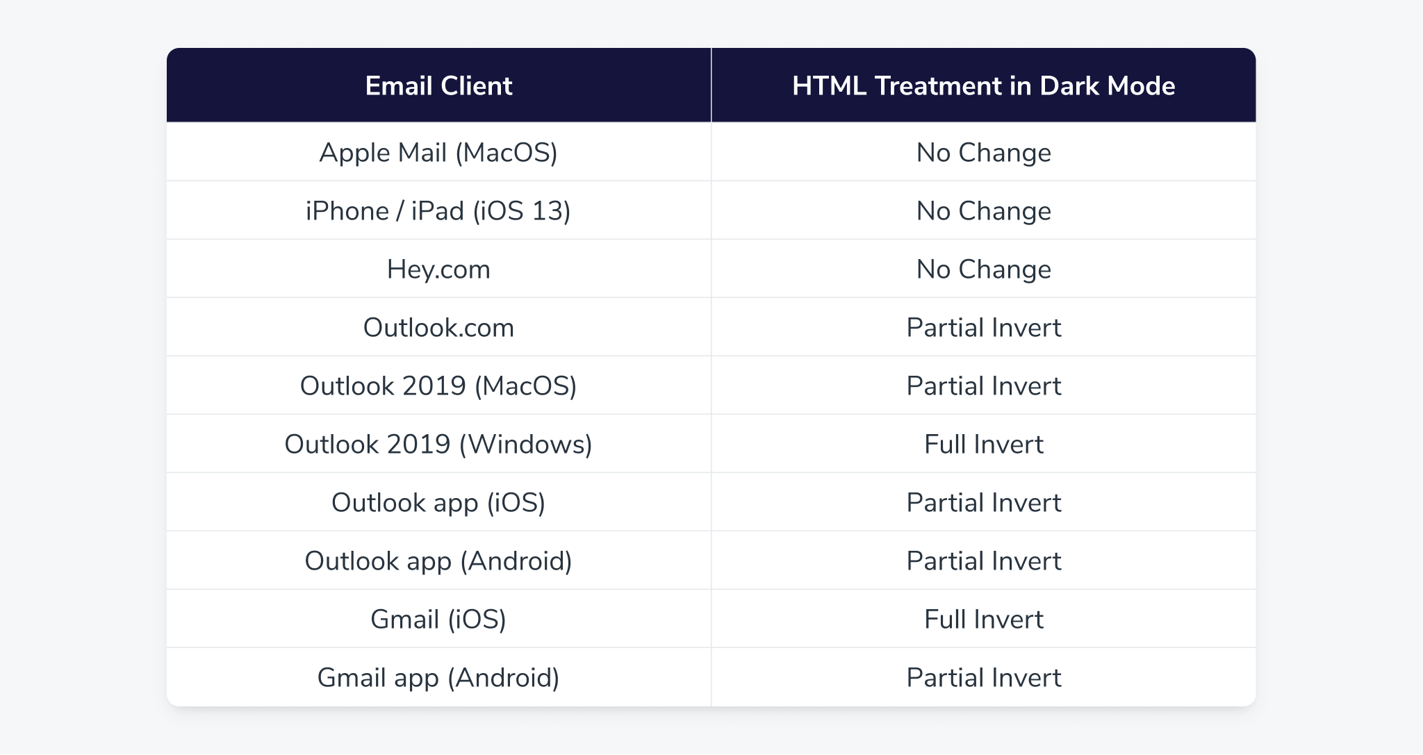
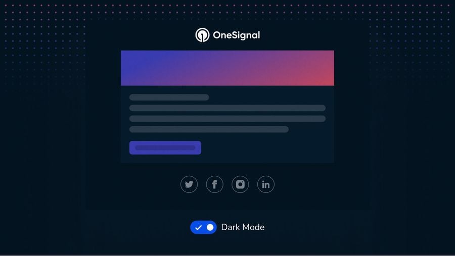
1. No Change
Unfortunately, this is exactly as unhelpful as it sounds. Even though your email client may give users the option to use Dark Mode, they will not affect how your HTML email is viewed at all. The below example was captured through Gmail on desktop.
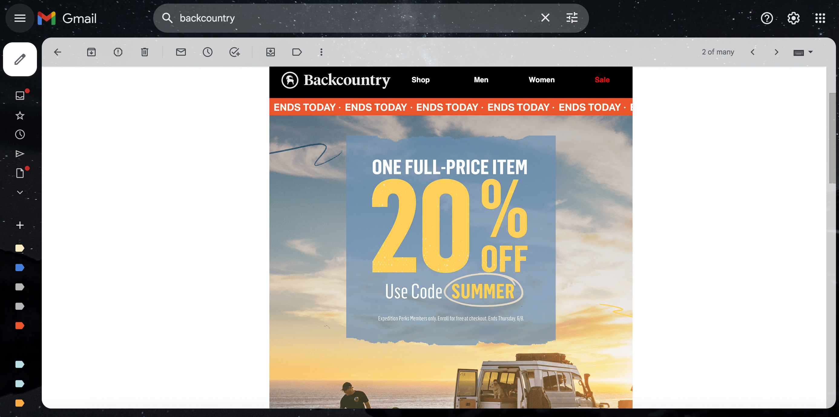
As you can see, even with Dark Mode enabled, emails look no different than they would using the lighter, default email theme. You may want to consider using an off-white (#fffffe) background in these cases instead to “hedge your bets” and look more cohesive across both light and dark modes.
The exception to this “no change” method is Apple Mail. In Apple Mail, plain text emails do, in fact, trigger the application of a Dark Mode theme. It’s important to note that the minimum code that blocks Dark Mode from applying to a plain text email is a 2×1 image.
2. Partial Color Invert
Some email clients, such as Microsoft Outlook, support partial Dark Mode correction. This means when the email client detects light backgrounds for users with Dark Mode enabled, the email is automatically adjusted to invert to darker backgrounds with lighter text. Portions of the email that were already dark will remain that way.
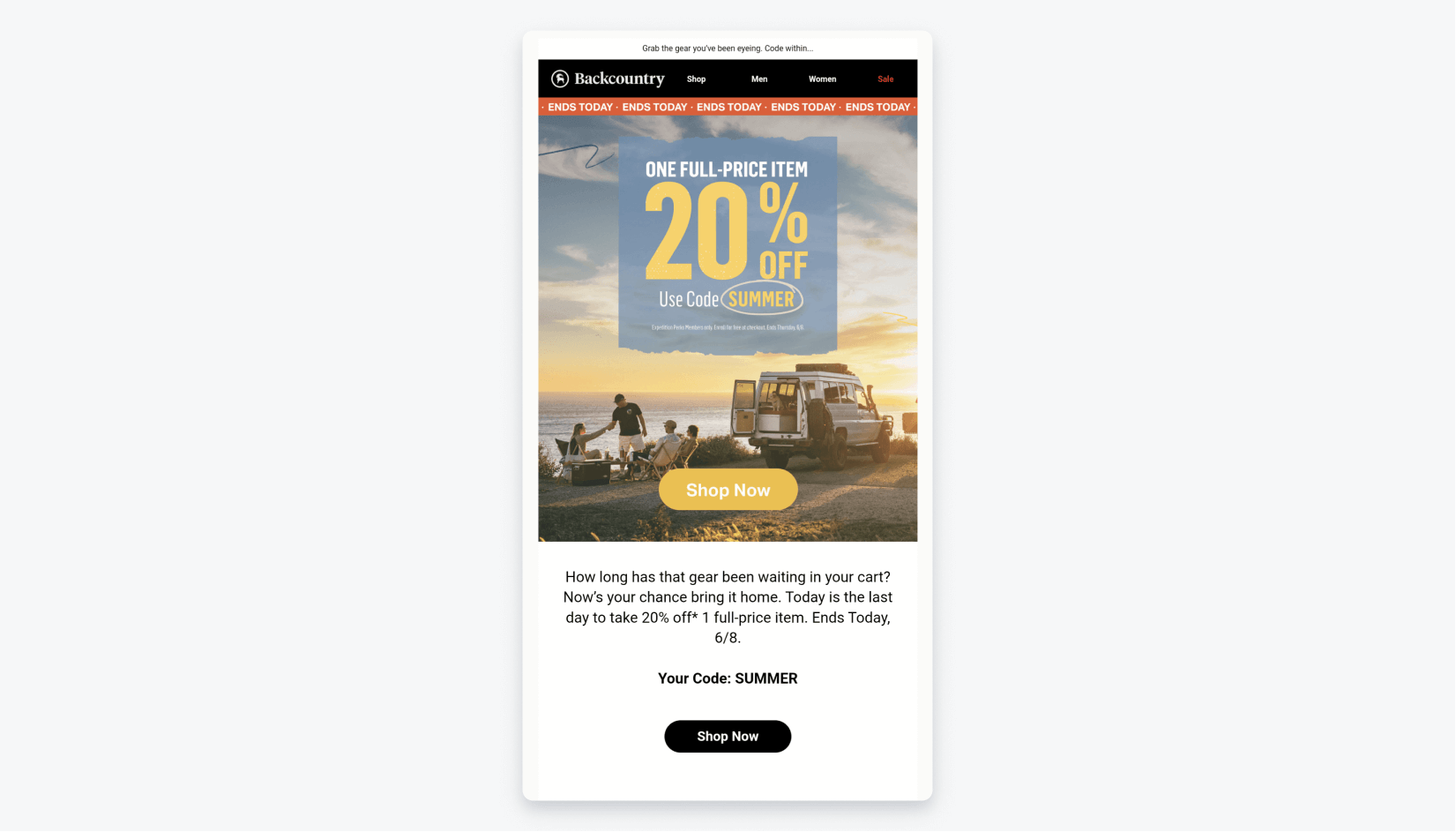
Notice, that even though the email remains readable with the partially inverted color scheme, the email elements that were already dark ( the bottom “Shop Now” CTA button) have remained dark and now completely blend into the inverted background.
Most email clients that use partial color inversion also support Dark Mode targeting. Dark Mode targeting allows you to override the client-default dark theme with emails that adapt dynamically to darker backgrounds.
This way, your email content remains legible and visually appealing, regardless of the selected email theme, creating a more consistent experience across all email platforms and for all user preferences.
3. Full Color Invert
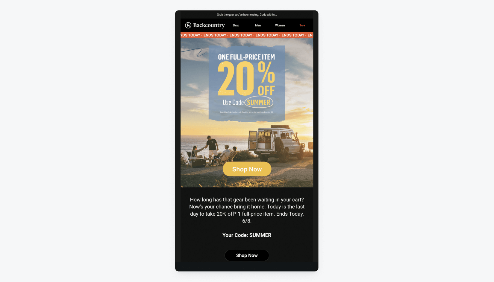
While the name implies a comprehensive solution, full color invert is the least nuanced method of adapting emails for Dark Mode. This broad-stroke approach not only inverts light backgrounds to dark but also existing dark backgrounds back to light.
While similar to partial invert on many emails, we can see that Gmail for iOS has fully and automatically inverted colors for this email, altering the CTA button text and background at the bottom. However, it also inverted the dark banner at the top, causing the brand’s logo to become almost invisible.
Helpful Dark Mode Code Snippets
The best way to ensure the most control over your users’ Dark Mode experience is to use code for manually adding Dark Mode styles to your email HTML.
Enabling Dark Mode
Add these meta tags in your <head> tag to enable Dark Mode within your email client:
<meta name="color-scheme" content="light dark">
<meta name="supported-color-schemes" content="light dark>
<style type="txt/css">
:root {
	color-scheme: light dark;
    supported-color-schemes: light dark;
}
</style>
Custom Dark Mode Styles
This is especially helpful for customizing Dark Mode styles in Apple Mail, iOS, and Outlook 2019 (macOS & iOS.)
@media (prefers-color-scheme: dark ) {
.body {
background-color: #172430 !important;
color: #ffffff  !important;
}
h1, h2, h3, p, td {
color: #ffffff !important;
}
/* More styles here */
}
Overriding Dark Mode Background Colors
style="background: linear-gradient(#262524, #262524); background-color: #262524;"Forcing White Text in Gmail
<!--Styles-->
<style>
u + .body .gmail-screen { background:#000; mix-blend-mode:screen; }
u + .body .gmail-difference { background:#000; mix-blend-mode:difference; }
</style>
<!--HTML-->
<p style="color: #ffffff;">
<span class="gmail-screen"><span class="gmail-difference">I am white text</span></span>
</p>
Using Off-White or Off-Black to Prevent Auto Dark Mode Changes
<style>
@media (Prefers-color-scheme: dark) {
.fubar {
background: #fffff0 !important;
color: #00000f !important;
}
</style>
Including Two Versions of Your Logo
Reverse their displays in the Dark Mode media query to swap them.
<img class=”light-img” src=”logo-light.png” alt=””>
<img class=”dark-img” src=”logo-dark.png” alt=”” style=”display: none;”>
Dark Mode Best Practices & Tips
While it’s important to stay up to date with the various ways email clients support (or mangle) Dark Mode on different devices, there are a few things you can do on the front end of your email design to set them up for success, regardless of which platform you are using.
Cropping
First, be aware of how you’re cropping your logo design. Images cropped too closely to your logo will appear cramped and crudely displayed in Dark Mode. Instead, make sure you’re cropping with enough space for your logo to breathe with purposeful white space around it. No one will notice the difference in Light Mode, however, in Dark Mode, your logo will appear intentionally placed and readable within a symmetrical white box.
Transparency & Outlines
Alternatively, you may wish to set your logo or icons with a transparent background (in both white and black.) This avoids cropping altogether and gives your logo a cleaner, free-floating placement in your emails.
To maintain dark designs in Dark Mode, consider adding a thin outline or stroke around your logo text or icons to ensure they’re visible on any dark background.
Contrast
As a general rule of thumb, text that is clearly contrasted from the background is easier to read. However, avoid using extreme contrasts like pure white or black as they tend to be harsher on the eyes and fatiguing to read for your users. Instead, you may opt for subtler greys to both stand out from the background and avoid making your users squint.
This goes the same for email hyperlinks. Sometimes your original “Light Mode” colored links may actually be a better fit in Dark Mode!
OneSignal, One Solution
Design the Dark Mode emails of your dreams that look just as good as they feel across all devices, not just desktop. Tired of fussing with high-cost, low-flex email providers? Our email composer uses free templates and a no-code approach to craft, segment, and optimize email campaigns for every device. 21st-century marketing requires responsive email software that integrates effortlessly with eligible email providers!
It’s not too good to be true... it’s OneSignal.
Try OneSignal For Free