In the real-world history of human cooperation, the call-to-action is perhaps the best example of “small but mighty.” From galvanizing miracle comebacks on the field to inspiring unified protests around the world, the humble CTA represents one of our most powerful and enduring language tools – all with only a few actionable words.
Join us for a look at how to fine-tune CTAs within your marketing strategy to drive clicks and capitalize on your campaigns (maybe not as noble as sparking a revolution, but a worthy endeavor for us marketing nerds looking to ignite the fiery embers of user engagement!)
If you'd rather continue your deep dive on creating conversion-friendly email content, look no further than the OneSignal Ultimate Guide to Email Campaign Performance.
What is a CTA?
A CTA, or call-to-action, is a prompt or directive that encourages users to take a specific action. CTAs are typically comprised of a brief two to four-word phrase (often accompanied by a hyperlink) and serve as a way to guide users toward a desired goal or conversion. Most mobile-optimized call-to-action prompts are designed to be visually prominent and compelling to catch the attention of users with smaller devices.
How Are CTAs Used?
In mobile marketing, CTAs are used within advertisements, emails, websites, text messages, in-app messages, and mobile push notifications to persuade users to take action (now, not later!).
When used incorrectly, CTAs come off as lazy at best and clickbait at worst.
However, when used correctly, effective CTAs can significantly improve conversion rates as well as drive clicks from, and to, a variety of destinations. Below are some examples of how different channels can leverage CTAs to motivate clicks to different targeted objectives.
Driving Downloads
Source: Mobile browser CTA
Destination: Prompts users to download a specific mobile application from an app store.
Making a Purchase
Source: In-app messaging CTA
Destination: Encourages users to buy a product or service directly from an app on their mobile device.
Signing Up
Source: Mobile push CTA
Destination: Prompts users to provide their information and create an account for a service on a website or in-app.
Subscribing to a Newsletter
Source: Promotional email CTA
Destination: This CTA invites users to subscribe to receive regular updates or promotional content via email or SMS.
Sharing on Social Media
Source: In-app feature CTA
Destination: This CTA encourages users to share content or promotions with their friends and followers on social media platforms.
Surveys and Feedback
Source: SMS CTA
Destination: This CTA prompts users to participate in surveys on a mobile site or in-app, which can help businesses gather valuable insights.
Elements of a CTA
Although your CTA represents a relatively brief moment at the end of your promotion, it’s also the pivotal juncture that will either clinch a conversion or allow your users to have the thought no marketer wants: “Maybe later” (hint: this usually means “maybe never.”)
To capitalize on your users’ attention, make sure your CTAs embody the following elements:
Clear and Concise Language
Mobile screens are palm-sized, so it's crucial to keep your CTA text thumb-sized. In other words, keep it short and easy to instantly understand! There is no room for ambiguity in a call-to-action, so use clear and concise language that conveys the intended action without requiring a second glance.
Action-Oriented
Utilize strong, action-oriented verbs in your CTA to create a sense of urgency and encourage users to take immediate action. "Buy Now," "Sign Up," "Download Now," "Get Started Today," or "Subscribe" are all great jumping-off points.
Prominent Placement
Position your call-to-action prominently on mobile screens to ensure it's easily visible and accessible to users. It should be strategically placed where it stands out from the background and catches users’ attention without being overshadowed by other design elements.
Responsive Design
Ensure that the CTA is designed to be mobile-responsive, adapting to different screen sizes and orientations. It should remain functional and visually appealing on all mobile devices and platforms. Need a refresher on best practices for adapting your email marketing strategy for multiple devices? Check out our Guide to Responsive Email Design here!
Minimal Distractions
Eliminate unnecessary clutter or distractions around your CTA to keep the focus on the intended action. Excessive information or visual elements confuse users and distract them from the focal point you’re attempting to direct them towards.
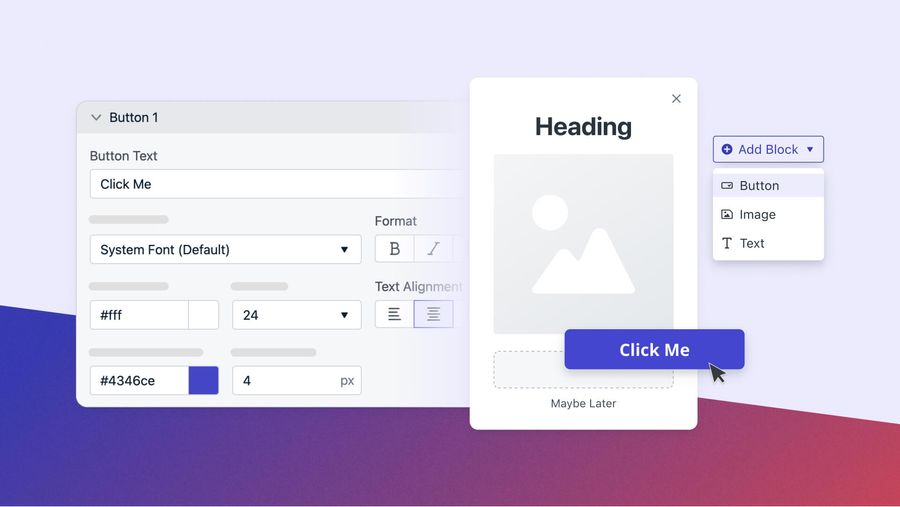
Finger-Friendly Size
Design the CTA button to ensure effortless tapping on mobile screens. The recommended minimum touch target size is about 44x44 pixels to accommodate different finger sizes and minimize accidental taps.
CTA Writing Tips
Your CTAs need to strike a delicate balance between inspiring action, being extremely brief, and fitting your brand’s specific audience to create a compelling opportunity. Use these writing tips to elevate your next CTA beyond the generic “Learn More Here.”
Not Later… Now!
We talked briefly above about using action verbs to create a sense of urgency with your CTAs. To that point, if your current campaign centers around a time-limited offer, make sure to include or imply this deadline.
FOMO can be one of the strongest driving factors for provoking quick clicks and driving conversions.
A well-placed "Limited Time Offer - Shop Now!" or "Don't Miss Out - Register Here!" generates a sense of immediacy and reminds users that their inaction means they’re losing an incredible opportunity. Take things a step further by implementing a live countdown timer to accompany CTAs that support limited time promotions. There’s nothing better than a literal ticking clock to inspire impromptu action and feed that FOMO!
Be Channel Specific
Not all CTAs are created equal. Depending on the channel you are using for your promotion, your CTA must fit the tone, space, and design of the copy it is following.
For example, where push notifications require CTAs with a limited character count (10-20 characters), time-sensitive phrasing, and a personalized tone, a blog post CTA will need to be hyper-relevant to the content preceding it and encourage readers toward related content or additional resources.
Where in-app messaging prioritizes CTAs based on user preferences, past interactions, or in-app behavior to increase relevance, an email CTA must focus on eye-catching buttons or hyperlinked text for a CTA to stand out amongst other email design elements.
Put the (Social) Proof in the Pudding
Your CTA is a great place to flex any impressive stats regarding your growing community. By including a call-to-action referencing the current reach of your brand, such as "Join Over 1 Million Satisfied Customers!", you instill trust in potential customers by telling them up front that they’re in good hands.
Is this just a corporate case of “C’mon, all the cool kids are doing it!”? Maybe. However, convincing your users that their decision to click isn’t a risk is an invaluable component to inspiring confidence in your brand. Plus, this implies a degree of exclusivity by encouraging potential customers to “join the club” and become part of a satisfied community.
Leave No Room For Mystery
The clearer and more explicit your CTA is, the more likely people are to follow through. This is an especially important note for mobile-first businesses. The number one selling point and reason (to this day) for the mass adoption of mobile devices is convenience. Your promotion messaging and CTA must emphasize convenience without muddying the waters of where it’s taking users. Eliminate as many perceived barriers to entry with your platform as possible.
It’s the difference between “Get Started” and “Get Started in Minutes!”. One leaves the “getting started” process a bit of a mystery. Will this take 60 seconds or five minutes? Your potential customers are often using their smart devices on the go or in between other tasks during their busy days. Your CTA should reflect how easy it is to accomplish your goal, whether it be registrations, completed profiles, or a quick conversion, all near-instantaneously and with one hand.
A/B Testing For CTA Optimization
Your call-to-action doesn’t end once you’ve settled on an action phrase and cohesive design.
Data-Driven Decision Making
A/B testing provides a data-driven approach to improving CTA effectiveness to help you make informed decisions, identify the most impactful CTA elements, and understand audience preferences.
A/B testing allows you to compare two or more variations of a CTA with a controlled sample group. Do people prefer a more professional tone of voice, or can you get away with being conversational and witty without sacrificing conversions? Which elements (text, design, colors, placement, button size) perform best and can be used for future promotions? Use A/B testing as your “laboratory” to perfect your CTA strategy ahead of time, and not after a series of underperforming campaigns.
Choosing the right A/B testing platform sets the stage for effective data collection and paves the way for more actionable insights. For example, OneSignal’s A/B testing software supports both iOS and Android, giving you the ability to effortlessly optimize your CTAs across every device.
Big Data, Bite-Sized Segments
A/B testing also allows you to gain insights into your audience's unique preferences and behaviors. By experimenting with different CTAs, you will learn which phrases, tones, and design elements resonate most with your target audience.
Once you have an understanding of your audience’s different motivation triggers, you can customize CTAs for different segments of your audience. By tailoring CTAs based on user demographics, preferences, or behavioral data, you can deliver more personalized experiences and increase the effectiveness of your CTAs for specific user groups.
There is no room for assumptions in marketing, especially when managing costly or complex campaigns. By collecting data on user interactions, click-through rates, and conversion rates through A/B testing, you are removing the guesswork from creating results-informed CTAs that drive sales.
Every CTA Has a Cross-Channel Messaging Strategy Behind it
Writing, segmenting, and analyzing your mobile messaging has never been this easy. OneSignal supports both developers and marketers, with omnichannel messaging support for push notifications, web notifications, in-app messaging, email, and SMS.
Now, here’s the moment you’ve been waiting for. The part where we tie it all together clearly, concisely, and urgently…
Try OneSignal Now For Free!