Don't blink. Content today is ingested at the speed-of-glance.
This means if your messaging is overly complex or lacking clarity, you are losing engagement at a remarkably fast rate.
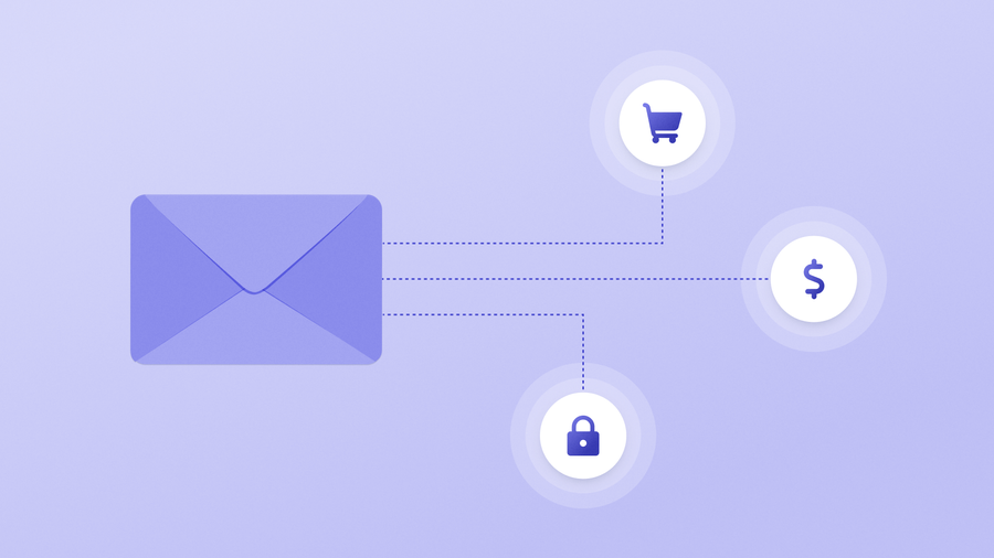
Transactional emails have long been a pivotal tool in the arsenal of brands striving to engage their audience while conveying critical information. Unlike promotional emails, which are crafted to entice customers with offers or announcements, transactional emails are directly triggered by a user's interaction with your platform. These emails serve as confirmations, notifications, or updates regarding transactions, registrations, password resets, or any other essential action initiated by the user.
Transactional emails have stricter limits than their promotional counterparts.
But just because something has rules doesn’t mean it needs to be boring.
Below are some transactional email examples to help you take advantage of this often-neglected channel to create meaningful moments of engagement.
Not Only For Crucial Information… But A Crucial Customer Touchpoint
Over 60% of web traffic comes from mobile browsing, meaning the importance of transactional emails has escalated even further. With mobile devices becoming the primary gateway to digital experiences for many consumers, these emails represent direct touchpoints that can enhance user experience, drive brand loyalty, and even facilitate future conversions.
By incorporating consistent branding elements, clear and concise messaging, and intuitive call-to-action buttons, these messages go beyond the simple account confirmation and effectively guide users through their journey, encouraging further interaction with your brand.
Conversely, a poorly designed transactional email, with cluttered layouts, confusing content, or lackluster visuals, not only risks being overlooked or disregarded but may also tarnish your brand's reputation and erode customer confidence. User attention spans are fleeting more every day, meaning every interaction counts — use the following five transactional email examples to inspire how you optimize your email marketing strategy.
Transactional Email Example #1: Regal Cinemas
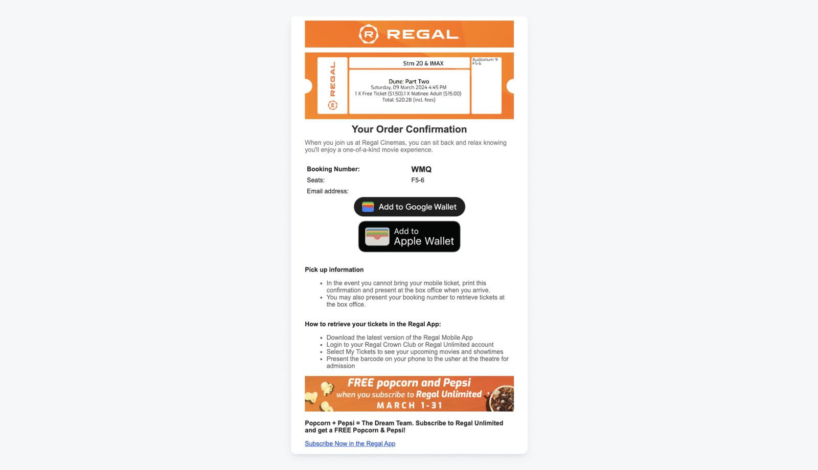
Regal Cinemas’ confirmation emails go beyond essential purchase information. By offering ticket pick-up information, Google/Apple Wallet functionality, and a handful of mobile app tips, this message becomes more of an event resource, than a barebones transactional email that remains in user inboxes, unread.
This is also a perfect example of how some brands toe the line when it comes to promotional content in the bottom banner — is the included promo relevant to the date of purchase? Yes. Would we suggest sneaking in promotional content in all your transactional emails? No. Save the advertisements for your promotional email campaigns. Email regulations dictate that users must explicitly opt-in to receive marketing messages, and you don’t want to get in hot water when it comes to the GDPR or CAN-SPAM Act.
The Good:
- Helpful content to avoid pain points while also driving traffic to the mobile app for a better user experience
- Excellent email design, making use of the brand theme and colors without sacrificing clarity or trying to squeeze in too much content
The Risky:
- Transactional emails typically are not supposed to include any sort of promotional content to remain email-compliant
Transactional Email Example #2: Chipotle
While we will concede that this brand has the edge when it comes to built-in anticipation and mouthwatering joy for their transactional messages, Chipotle’s confirmation emails sure know how to make use of limited space.
They present the message in a way that draws your eyes immediately to the most important and glance-able information (pickup time) without requiring you to read any further. However, for users who do want more information, Chipotle doesn’t make you scroll far to find it. A confirmation number, support chat link, pickup address confirmation, and brief pickup instructions leave little room for incorrect assumptions. Remember, assumptions are the gateway to user friction — be proactive and volunteer as much helpful information as possible.
To cap it off, Chipotle flexes some creativity by including some fascinating (and personalized) stats showing off their “Real Foodprint” responsible sourcing with a link to learn more. If your brand has any socially conscious, ethically mindful, or simply just brag-worthy tenets, transactional emails are a great place to build user trust and elevate the transactional experience in a personal and engaging way.
The Good:
- The most important information is clearly visible at a glance
- Easy access to customer support and customer rewards
- Dynamic, perosnalized content regarding customers’ “foodprint”
- Included survey link to encourage feedback
- Personalized, with customer’s name
The Risky:
- “Download Our App” CTA is buried at the bottom of the email
Transactional Email Example #3: Zillow
Transactional emails aren’t limited to receipts and confirmations. This welcome email from Zillow utlizes an extremely simple and skimmable design, while offering a few actionable ways to succeed on their platform. This is a great example of a transactional email designed to skip the lengthy tutorial or content-heavy welcome and get users started quickly.
The Good:
- Cohesive color design with a format that funnels your attention straight to the CTA
- Practical tools and references to enable new user success
The Risky:
- The lack of content may leave specific, account-related questions or concerns unaddressed
- Although this email has a clean design, it may feel a little too “automated” or impersonal for users due to its lack of real world imagery or human faces
Transactional Email Example #4: Ka’Chava
Nutrition brand Ka’Chava leverages a more exhaustive transactional format, giviing customers a plethora of information in addition to their order, including a link to place an extra order, an easy-to-read CTA directing users to their account to make changes, and even a voucher to encourage future purchases.
This email excels in clear and specific copy, sharing everything from delivery estimates to specifying that “no action is required,” leaving little room for confusion. Notice they also reserve space toward the bottom of the email to share their proudest brand standards and guarantees.
The Good:
- Plenty of resources for users to get more information about their order
- Account-specific voucher to drive continued engagement and conversions
- Additional brand information like ingredients, how-to’s, and reviews
- Excellent inclusion of safety standards, sustainability, and risk-free trial
The Risky:
- Although it includes a ton of helpful content, for a transactiona email, this runs the risk of becoming a bit lengthy and cumbersome to read
Transactional Email Example #5: Rippling
Transactional emails that only serve a single purpose, such as this message from Rippling informing users of their paychecks, shouldn’t be afraid to have fun. Where other transactional emails typically play things safe, Rippling creates an opportunity to delight users with friendly copy and an adorable animated gif to turn an otherwise boring alert into a reason to smile.
The Good:
- C’mon, it’s a French Bulldog with a baguette!
- Succinct, conversational copy
- The message keeps users’ personal paystub information private, instead offering a link to login to their account to view their paystub
The Risky:
- Not much to critique here. As far as single-use transactional messages, this one hits it out of the park
Don’t Settle For Boring Transactional Emails
The majority of brands don’t put in the time to make transactional messages a true customer touch point, but it’s precisely these “little things” that make your user experience memorable, engaging, and most importantly, worthy of repeating.
OneSignal removes the barriers of other, costly email providers by providing a no-code email builder designed to make every transaction personalized and compatible with your larger omnichannel messaging strategy.
Get Started for Free