Email branding is the process of conveying a consistent brand identity through your emails by standardizing brand elements such as your send address, copy, graphics, layout, and logo.
According to the available data, consumers spend around thirteen seconds reading an email, which gives you limited time and space to make an impression.
Email offers a high ROI, high visibility, ample space to communicate a message, and a variety of other benefits to your communication strategy. When you consistently brand your emails, you build familiarity with your customer base so that they can easily recognize your brand communications in this channel.
So Why is Brand Consistency in Emails Important?
Benefits of Email Branding
- Maximize Value: Branding your emails will ultimately contribute to better engagement with your list, which in turn makes this channel more valuable to your company. Boosting your brand identity on this channel will pay off in the long run by improving opens, engagement, and other email marketing benchmarks.
- Increase Brand Awareness: Brand awareness is the likelihood that consumers recognize your brand. When consumers can easily identify your brand, they’re more willing to trust your company and its offerings, ultimately making them more likely to purchase from you. Establishing brand guidelines contributes to this goal by ensuring that you communicate a consistent marketing message.
**Supporting this concept, one study found that communicating a consistent marketing message across multiple channels can boost brand perception by 68 percent and purchase intent by 90 percent among consumers.
- Drive Revenue: According to a HubSpot survey, 59 percent of marketers say email is their biggest source of ROI and 59 percent of respondents reported that emails influence their purchase decisions. The impact of email is undeniable, especially when you execute campaigns with consistent branding.
What Elements Of An Email Can Be Branded?
1. Email Send Address
Your email send address is the business email address that appears in your recipients’ inbox when you blast off email campaigns. A sender address communicates the origin of your emails and is important for creating a positive first impression. This email element identifies your company to recipients, which legitimizes you as a sender and is also critical in getting recipients to click and read through your email content.
2. Subject Lines & Snippet Text
Your subject lines and snippet text are short-form elements within your emails. They also form part of your first impression on your recipients. Your email subject line is similar to a tagline and should tell readers why they should click on your message. Subject lines are concise, but they should still remain consistent with your brand voice and tone. Developing a company standard for this component is crucial in getting your message the clicks and opens you want.
After your subject line, Your snippet text is the first line of text your recipients see in their inboxes. Snippet text is also referred to as preheader text or a “Johnson Box.” A best practices for snippet text is to keep this component to 40-50 characters in length and include a Call-To-Action (CTA) encouraging recipients to read on. You can understand how well your email snippets are performing by monitoring your click-to-open rates, click-through rates (CTR's), and unsubscribes. Make sure to compare your email KPI’s to industry standards.
3. Company Logo & Iconography
Branding your emails with your company logo and iconography is important because these visual cues allow your recipients to more quickly and easily identify your brand. 80 percent of all information that is absorbed by the brain is visual in nature, according to studies, which makes the case for visual branding even more compelling.
Your logo is in many ways the centerpiece of your brand’s visual identity. Stamping your emails with your logo continues building recognition and further legitimizes your email communications. Your logo treatment and placement should also be uniform across your emails. Establishing consistent logo placement and sizing will also save your team time down the line and minimize the risk of these elements not rendering properly.
4. Fonts
In email marketing, your font choice is also an extension of your brand. Fonts are recognizable style elements that should reinforce your brand tone and convey your unique style. For example, if you’re in the financial services industry, you may choose a more serious font to convey formality, whereas if you’re a playful cosmetics brand, you may opt for a fun and flirty font.
Either way, it makes sense to establish a rule of thumb around your fonts to ensure both consistency and readability. The other challenge you're up against is that fonts can be tricky on the technical side. Not every email client displays them the same.
Basically, when your recipients are on their devices, their browser and email client read code that tells them what font to display. If the font you're using isn’t recognized by a browser or email client, it may be substituted for a different font, which can mean your email could appear differently from how you initially intended it.
You’ll have a better chance of your emails rendering if you cross-check with an up-to-date list of email and web-safe fonts. This way, you can ensure all your subscribers are receiving your emails in a uniform typeface.
Some of the most common safe fonts for email include the following:
- Arial
- Helvetica
- Georgia
- Tahoma
- Lucida
- Times
- Trebuchet
4. Footer Information
Although your email footer comes last, it definitely shouldn’t be an afterthought! As the close to your email content, it’s an important piece of your email branding strategy. Your footer may be a small piece of an email, but the information it includes needs to be strategic.
Your footer is like a modern business card. This element, also referred to as an email signature, is a block of text that appears at the end of your email message and usually provides your recipients with details such as name, job title, and phone number, and can also contain elements such as scheduling links, banners, certifications, and award logos.
Setting guidelines for how your employees format their email signatures is all part of creating a uniform brand experience. Branded email signatures add to a cohesive brand experience and improve your credibility as recipients receive more and more messages from your company.
Keep in mind that your subscribers also look to your footer for contact details and to manage their subscription to your list. This email element is legally subject to requirements stated in the anti-spam laws in effect in the regions you operate in. Anti-spam laws you should be aware of include CAN-SPAM, CASL, and other regulatory frameworks.
To remain compliant, you should always include a clear unsubscribe link and make sure the design of your footer makes this a transparent process. Although no email marketer is thrilled to see unsubscribes, providing a clear way for uninterested recipients to opt out is core to maintaining transparency and showing that you respect your customers’ wishes. For recipients desperate to opt out, you’ll want minimize confusion and friction in this process. If you fail to make unsubscribing a seamless process, your recipients could mark your communications as spam, which could tank your email sender reputation.
In addition to a mandatory unsubscribe link, you must also legally include a mailing address, a link to your privacy policy, and a contact email address in your footer. Make sure you have all these pieces in your footer as part of your guidelines to avoid paying substantial fines.
Social media buttons and website links are not required by law, but they can be a useful addition to your footer content. If including links redirecting users to these other channels adds value and doesn’t distract from your primary CTA, feel free to add them.
5. Email Design Layout and Colors
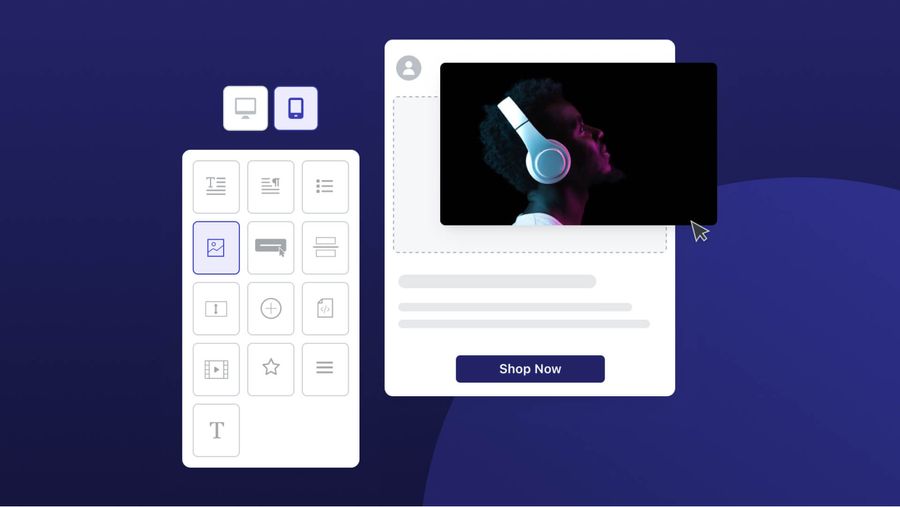
Your email layout should achieve a balance between the visual and the written elements you’ve included. Your design should be aesthetically pleasing, while not distracting from the key message and CTA you’re trying to convey.
With that, you should consider standardizing your layout around the following design principles.
- Content Hierarchy- Generally, it’s best to highlight your most important content first, placing it above the fold.
- Skimmable Content- For recipients with a short attention span or limited time, it’s important to convey your core message in a scannable way.
- White Space– Support a clean and visually appealing design by including white space between design elements.
- Text and Images– A useful rule of thumb is to use around 60 percent text and 40 percent images to achieve a healthy balance between the written and visual elements of your message.
- Colors- Your color palette contributes to brand recognition. One study shows colors are shown to increase brand recognition by 80 percent. Your brand colors also evoke the viewer’s emotions and associations.
- Headings- Use headings and subheadings to maintain organization and visually separate your content.
A Note on Responsive Design
In establishing your email brand guidelines, make sure you’re using a responsive design. A responsive email design makes it so that your email changes to format the screen it's viewed on across mobile and desktop. One study shows that over 70 percent of people read their email in a mobile app, which means responsive design should be a top priority in your email branding process.
Onboard Your Users More Seamlessly with Email
Increase the chances that your users stick with the following email onboarding tips.
Read: What to Include in a User Onboarding Email


