By integrating personalized messaging at each stage of the customer journey, lifecycle emails function as critical guiderails that steer users through the stages of awareness, consideration, purchase, and loyalty. A context-rich welcome message or personalized re-engagement email sent at the right moment is often the difference between churned users and brand champions.
The psychology behind lifecycle emails is rooted in their ability to resonate with users on a personal level. They address users not based on what they bring to your brand but rather as individuals with their own definition of how your brand fits within their day-to-day lives. Done effectively, this personalized approach taps into triggers such as reciprocity, where users feel more valued, leading to sustained usage and increased lifetime value.
For a complete overview of meeting your users as the correct place in their journeys, this Journey Engagement Guide goes into more detail.
These seven lifecycle email examples illustrate how helpful and dynamic your messaging should be to maximize retention rates.
Lifecycle Email #1 — The “Covering All Bases” Welcome
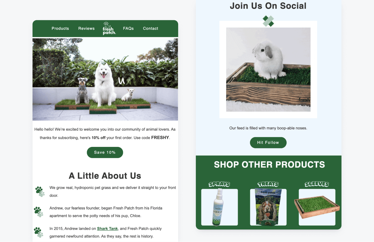
This welcome email from pet product company Fresh Patch sets new customers up for success through a variety of value propositions, all designed to point them in the direction most natural for them at this early stage in their journeys.
- They start with a simple, warm welcome and a 10% discount to incentivize customers who may be immediately interested in purchasing.
- For those who aren’t yet ready to purchase, Fresh Patch includes a brief brand elevator pitch in the form of digestible bullet points highlighting their most popular product, their origin story, and their appearance on Shark Tank — all of which lend to sharing their core value propositions: convenience, genuineness, and credibility.
- Fresh Patch also includes a prominent feature for its social media presence, capitalizing on its massive (and inherent) brand strength—an adorably irresistible online community.
- Lastly, they end their welcome email with a footer detailing some of their other auxiliary products to reinforce that they’re not just a brand that delivers fresh grass to pet owners, they’re a brand that has your back when it comes to solving a very real problem: the training and ongoing comfort of our furry family members.
Apps that send onboarding messages have 24% higher install-to-purchase conversion rates.
Lifecycle Email #2 — The Fork-in-the-Road Welcome
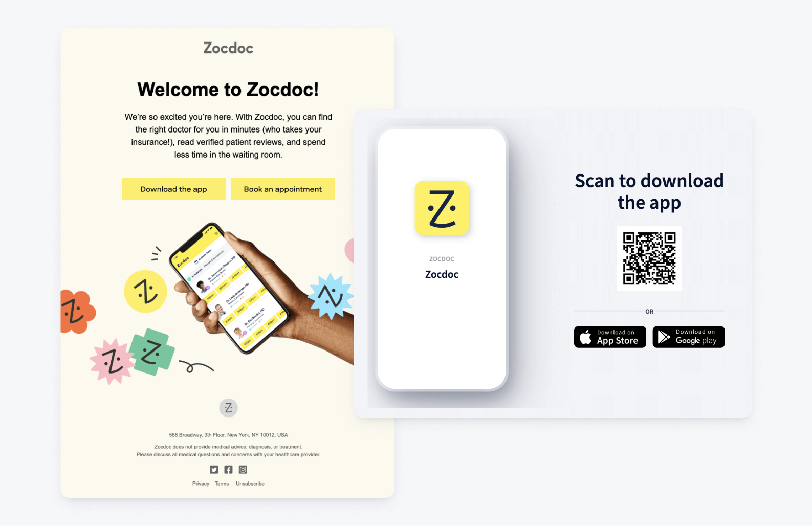
As a direct comparison to the above example, it is worth noting that there is more than one way to onboard new customers. Mental health booking service Zocdoc uses its welcome email as a stage for driving users to their mobile app. After a brief bit of copy touching on some of their most practical benefits, they give new users only two places to go:
- “Download the app”—This takes mobile browsers directly to the Zocdoc app store page and web browsers to an app download page containing a QR code.
- “Book an appointment” — This funnels users directly to their platform to encourage conversions.
Although it seems counterintuitive (and depends on your industry), sometimes offering fewer options helps alleviate the overwhelming nature of entering a new brand’s ecosystem and actually increases the chances of quick conversions.
Lifecycle Email #3 — The Progress Report
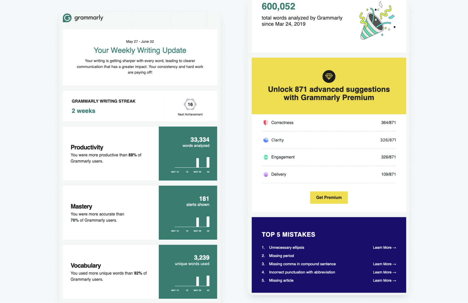
Ah, usage statistics — the vanity mirror of mobile engagement! There are a couple of reasons why email reports like the above from Grammarly are so effective. The first is that usage reports validate users' efforts and achievements by showing progress and milestones. Whether it's tracking fitness goals, spending habits, or writing productivity, seeing tangible evidence of improvement is highly motivating.
This validation taps into the human desire for achievement and recognition, providing a sense of accomplishment that encourages continued engagement and effort. Notice how Grammarly adopts a celebratory tone by congratulating users on their total words analyzed as well as their current writing streak. Gamification can be incredibly engaging when backed by personal data.
Speaking of personal data, the second reason usage reports are so engaging is because they’re inherently just that… personalized and tailored to the individual’s specific actions and preferences. This high level of relevance makes the content feel more meaningful and valuable to the user. It demonstrates that Grammarly understands and caters to their unique needs and interests. This relevancy enhances the overall user experience, making it more engaging and satisfying. Notice how Grammarly includes users’ “Top 5 Mistakes” — turning a seemingly negative into a teachable moment and something helpful for users.
Lifecycle Email #4 — The Personalized Re-Engagement Incentive
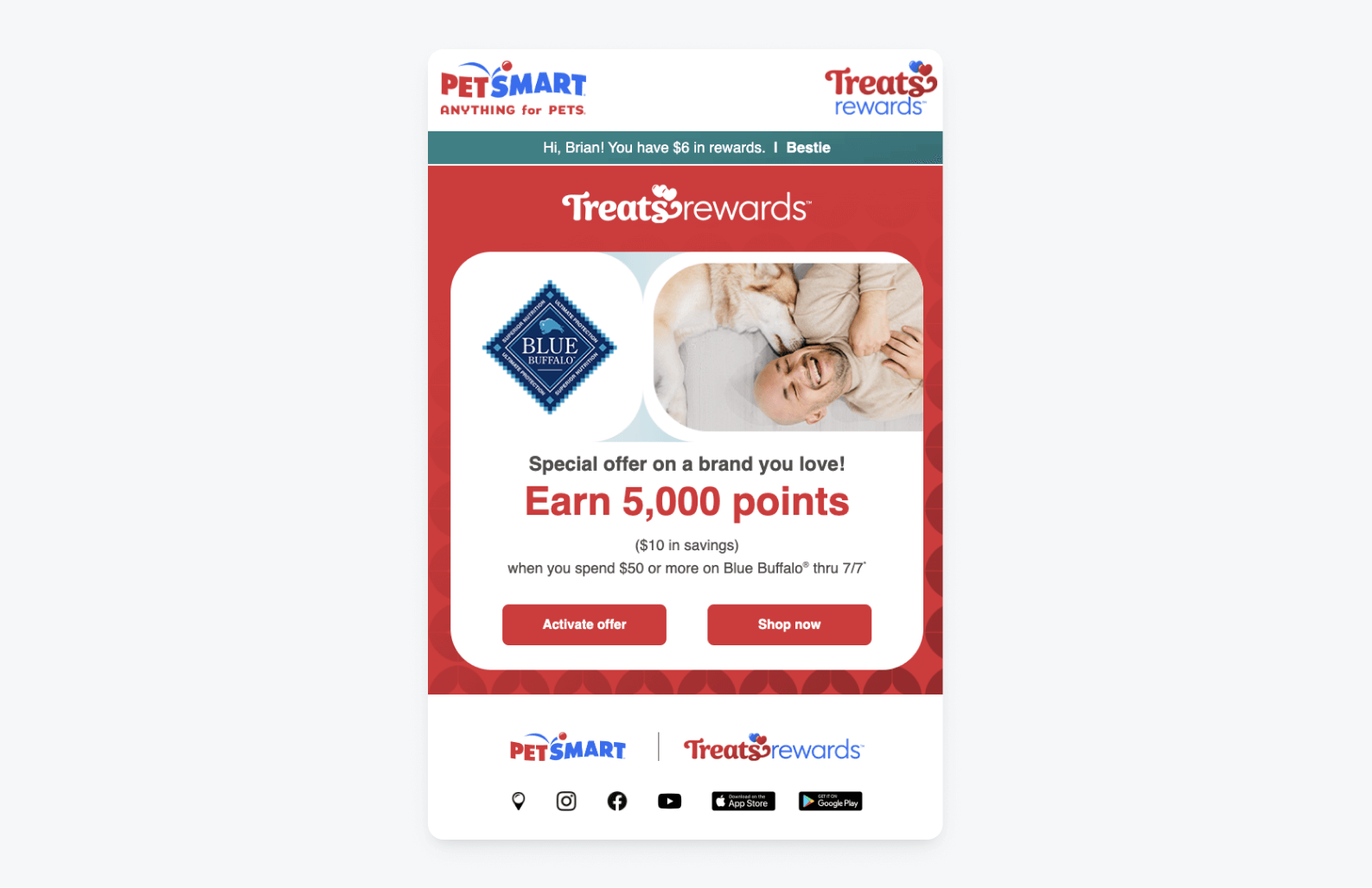
We are more likely to engage with content that feels directly relevant to our interests, and the exclusivity of this personalized offer email from PetSmart is a perfect example of this. The offer is targeted based on the user’s past purchase history with the Blue Buffalo dog food brand, offering bonus reward points for making a repeat purchase.
By tailoring rewards and offers to the specific preferences, behaviors, and past interactions of individual users, these emails create a sense of personal connection and value. As a bonus, notice how PetSmart reminds its customers of how much reward money they have saved currently (the blue banner at the top) to reinforce a sense of progression and remind them of the money that should be burning a hole in their pocket!
Lifecycle Email #5 — The Referral Program
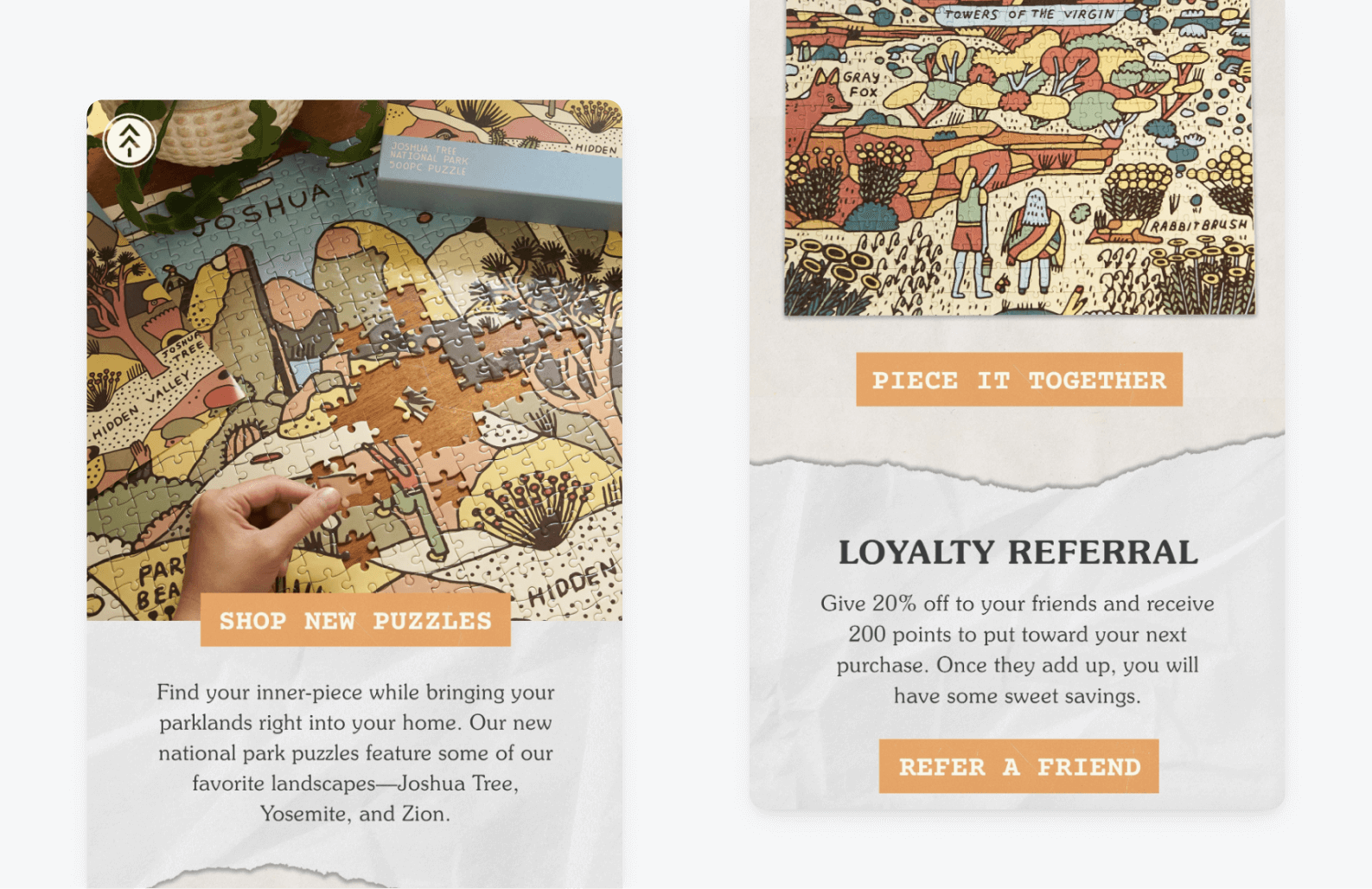
Referral programs are a fantastic way to drive app traffic via word-of-mouth promotion, but as you can see in the above example from the outdoor brand, Parks Project, they don’t always warrant their own dedicated campaign.
Your referral program is a great opportunity to seamlessly integrate additional value into communications that your users are already inclined to open. By embedding these programs within relevant promotional emails, you capitalize on the existing interest and engagement, subtly encouraging users to take advantage of the referral or loyalty incentives without overwhelming them with separate messages that may feel like homework.
Check out these 7 ways to incentivize your referral campaigns to drive more app traffic!
This approach not only increases referral awareness but also enhances the perceived value of the original promotional offer, as users see the added benefits of participating. And on top of all that, it reinforces the idea that your brand continually provides opportunities for users to gain more rewards, fostering a sense of ongoing engagement and loyalty.
Lifecycle Email #6 — The Feedback Request
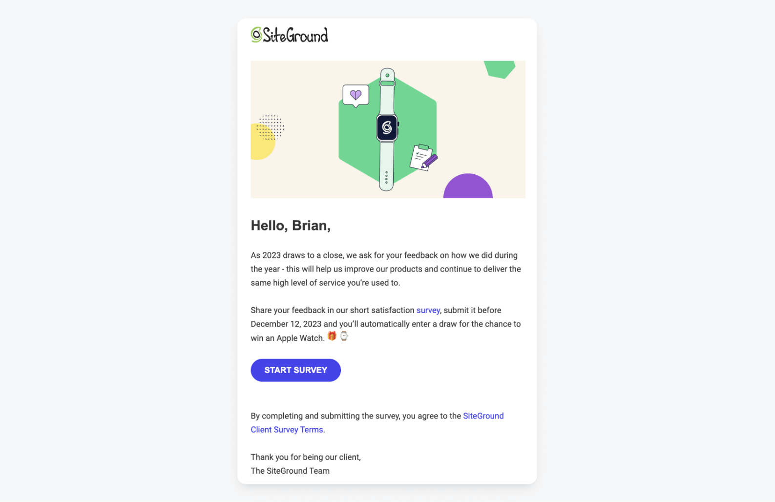
This one is tricky, as I’m sure we’ve all awkwardly stood at the counter promising we’d take a survey or leave feedback knowing full well we probably won’t. To combat that disengagement with your online feedback pathways (which are even easier to ignore than in-person ones), a little extra incentive may be in order.
This email from the web hosting company SiteGround makes taking a survey worthwhile by offering a drawing to win an Apple Watch. This approach not only increases response rates but also enhances the quality of the feedback, as users are likely to take the survey more seriously when they know they are being rewarded. Additionally, it demonstrates that SiteGround values its users' opinions and is willing to invest in their satisfaction, fostering a stronger connection and loyalty to the brand.
These in-app survey building tips will help you get started increasing the likelihood of user feedback.
Lifecycle Email #7 — The Upgrade
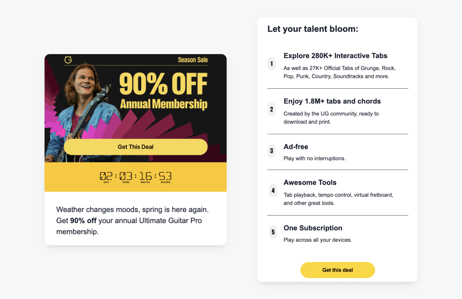
UltimateGuitar, the musician’s tablature provider, offers existing users a (steep!) discount on upgrading to a pro membership appeals to users' desire for enhanced features and benefits at a lower cost, making the upgrade very attractive and accessible.
The inclusion of a countdown timer is an excellent choice to emphasize the limited-time nature of this offer and motivate users to act before they miss out. Combined with the premium benefits listed on the right-hand side, this email makes a compelling case for users to invest further in the app, reducing the likelihood of churn as they become more reliant on its advanced features. This strategic move not only boosts immediate revenue but also strengthens long-term user loyalty and retention.
Create Emails That Go Beyond Day-One Engagement
As mobile marketing continues to become more and more unified, strategically combining your messaging channels has become a prerequisite for sustained success. OneSignal’s intuitive drag-and-dorp email composer and multichannel Journeys builder unlock a whole new way for you to delight users at key engagement moments.
Get Started for Free