Our clients never cease to amaze us with their creative and effective push campaigns. What better way to understand the best way to write push notifications than through these real-world examples!
Well-designed push notifications work to inspire, entice, connect, and inform users, leading them to grow a greater affinity for your brand and further leverage your offerings.
Let’s take a look at 10 fun push examples across the food, gaming, eCommerce, mhealth, and media industries and break down what they do well.
1. Teasing New Products
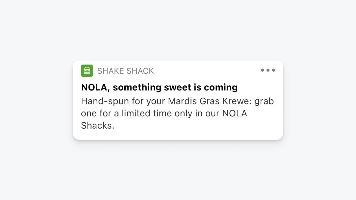
We appreciate this push notification example from our client Shake Shack, as it does several things well. First, the copy uses a creative riddle format to entice the reader into learning about a new drink that’s coming soon. The notification even includes a cute shake emoji hinting at “something sweet” the company is offering.. Not only that, but the notification copy is also personalized and localized. The acronym “NOLA” is local slang for “New Orleans” that residents outside this region wouldn’t be familiar with. Using the classic second person “you,” the brand also creates intimacy with the user through classic marketing psychology.
2. Popping a Question
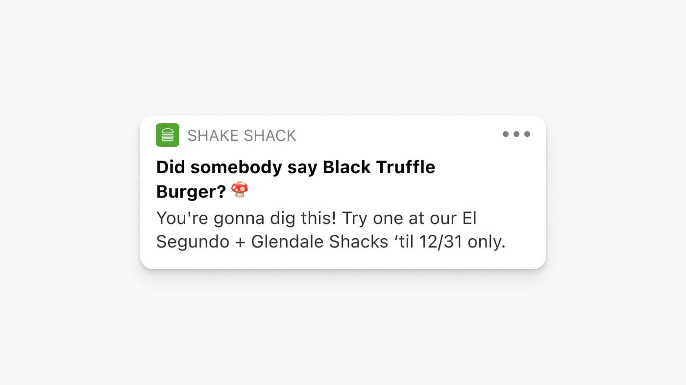
In another notification the company sends, Shake Shack uses a question in its headline to draw a user’s attention to a new product, the Black Truffle Burger. Research shows that questions implicitly inspire engagement, which is one reason this message is well-crafted. The copy is also informal and colloquial in nature, which represents this company’s brand voice and makes the message more relatable to their target customer. The cheekiness and informality of the copy align well with Shake Shack’s unique brand style and the body text gives users a clear next step— to buy the new product at the El Segundo location. This clear CTA helps smoothly connect the app experience to the brick and mortar locations where users will ultimately taste the true value of their meal!
3. Rewarding Progress
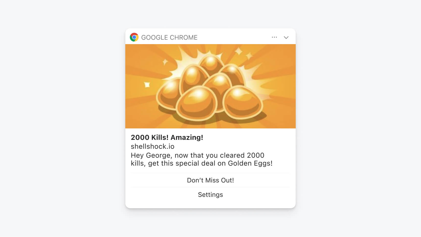
Bluewizard sends this hyper-personalized, motivational web push notification to users who’ve reached a certain milestone in their egg-shooting game. The notification congratulates a user for making 2000 kills and offers a special deal as a reward for this achievement. Including a user’s first name in the message copy and speaking to their unique in-game accomplishments are surefire ways of creating a one-to-one connection and spurring reengagement. Not to mention the image of a shiny pile of eggs that awaits the user who clicks back into the game. This notification is well-rounded, complete with an incentive, rich media, and personalized elements.
4. Providing Timely Updates
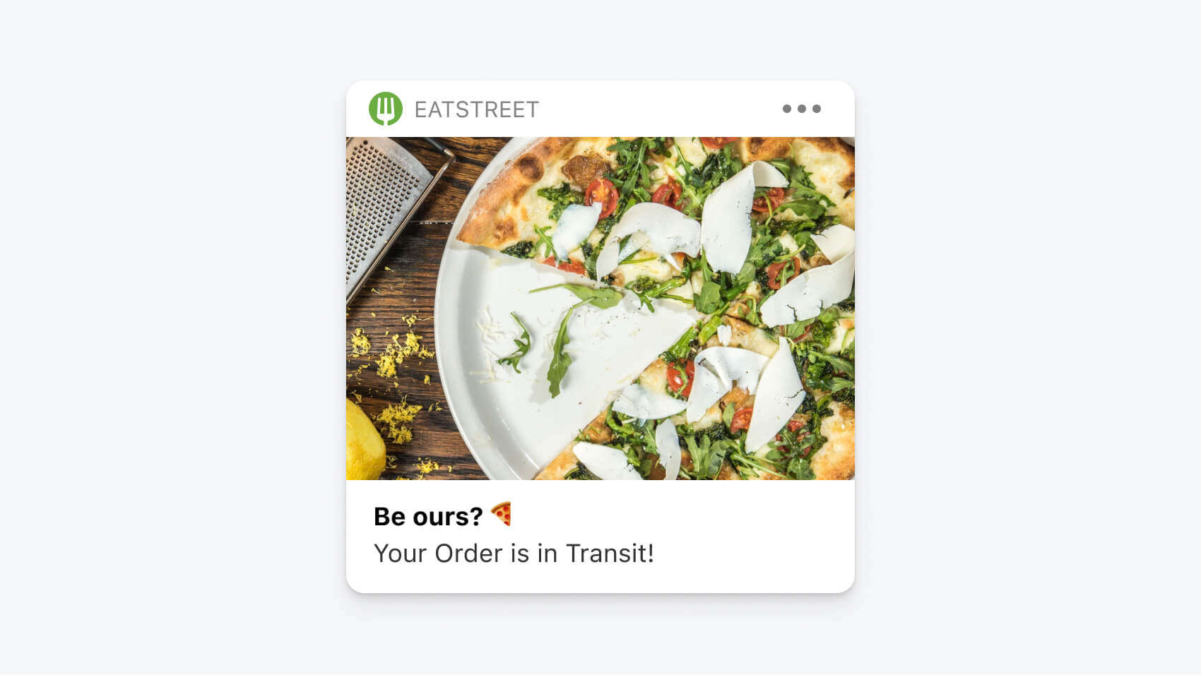
This transactional push notification gives users an update on the status of their piping hot pizza. Timely updates offer a ton of value and trace an important step in the buyer’s journey. Food app users expect these types of instant and real-time updates after placing orders as they anxiously anticipate delivery. We love the way that Eatstreet instantly passes along relevant information in a fun, visual, and mouthwatering way.
5. Retargeting Cart Abandoners
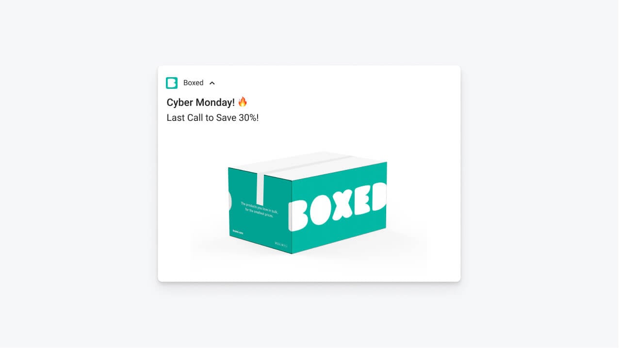
If you’re familiar with the discouraging number of abandoned carts that never receive the love and care they deserve, this notification will speak to you. eCommerce brand Boxed uses a rich notification to convey a limited-time offer for Cyber Monday, complete with direct, urgency-driven copy and a strong CTA. The fire emoji in the headline and accompanying exclamation points in the notification copy drive home the key point —that users should come back and take immediate action on this sale. Push notifications are a direct and compelling way to retarget users who’ve fallen off before purchase and need an extra nudge to follow through at checkout, which in turn can reverse the dismal abandoned cart stats companies in this vertical often face.
6. Delivering Promotions
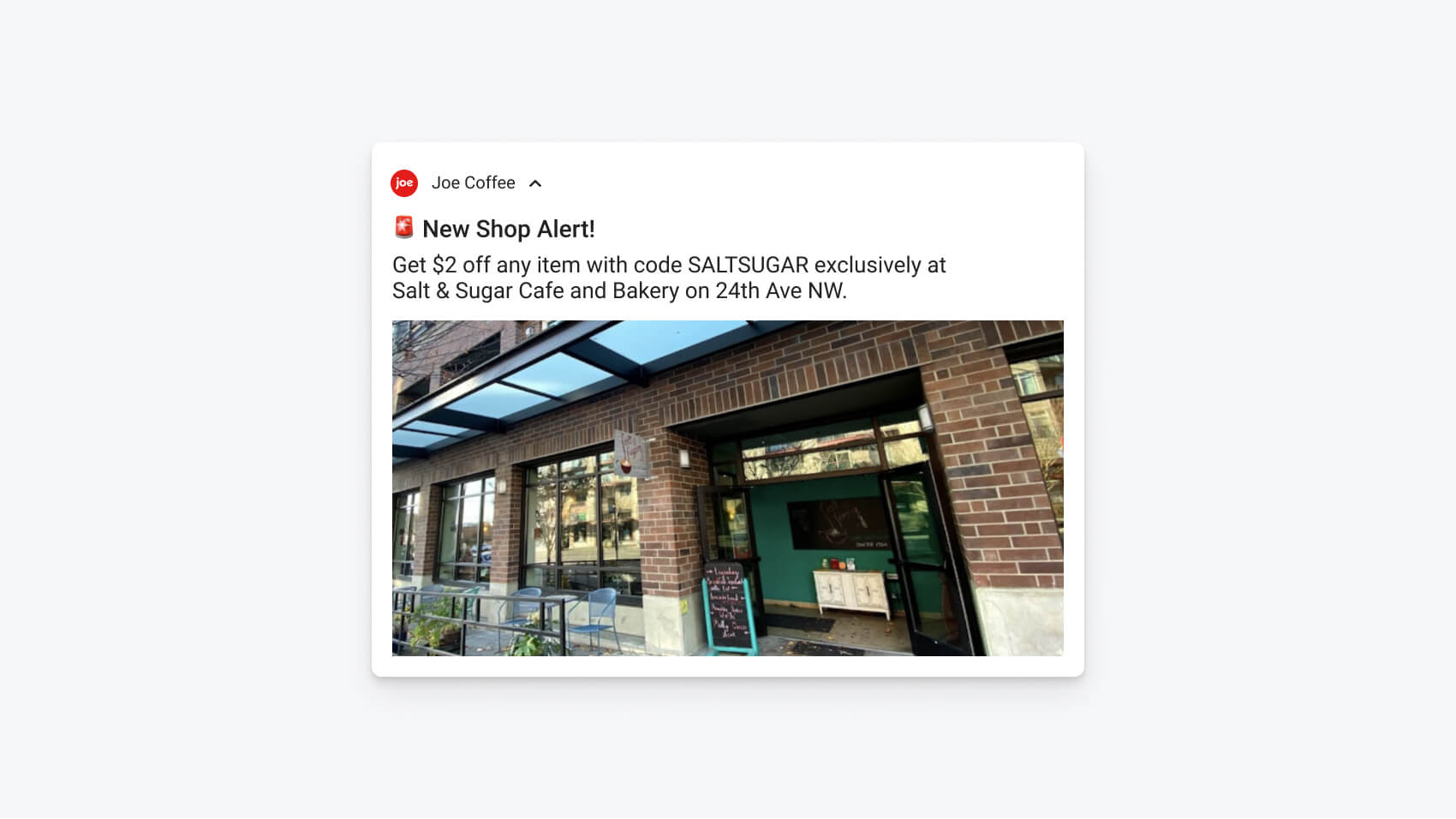
Joe Coffee is an application that allows independent coffee shops to accept mobile orders and payments at no additional cost.
With this stimulating notification, Joe delivers a promo code to hype up one of its merchant's new shops. Promo codes are a classic psychological tactic for creating urgency, and the alert bell in the notification headline reinforces this time-sensitive message. The body copy also conveniently communicates the exact location of the store, making it easy for users to take action on this sweet and salty deal.
7. Personalizing deals
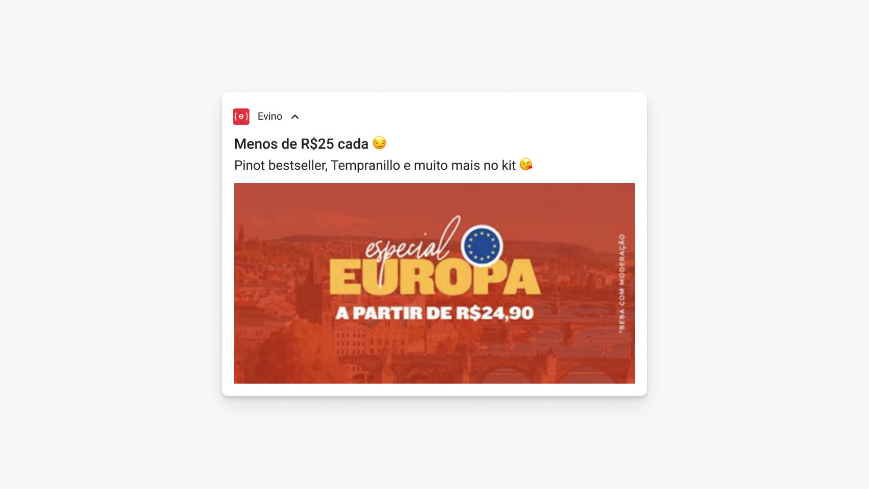
Our client Evino sees impressive returns from their push campaigns, In an average week, their push notifications convert to 1,800 orders and an estimated 8 percent of their total revenue.
Their secret? They tailor notifications based on information such as geographic location, prior purchase data, engagement, and personal attributes. This flirty and fun notification example advertises a deal for the brand’s best-selling Pinot to a subset of users who’ve been active in the past month. The copy uses slang, emojis, and a bright red graphic advertising the deal in question to immediately relate to users and capture their attention with this intoxicating special.
8. Encouraging Symptom Tracking
Project Rōnin uses push to encourage symptom tracking. The healthcare app they’ve built helps cancer patients track symptoms and side effects to better optimize care.
Here’s an example of how the company leverages push to remind cancer patients to report their symptoms between appointments. As cancer patients undergo chemotherapy, they often experience memory lapses, fatigue, and cognitive impairment. This notification pops up in front of patients gently reminding them to report back to their care team, even though they might not feel like taking an in-app symptom survey while they’re not experiencing symptoms. Push notifications such as this one are critical to the app’s functionality, because they encourage users to routinely input the personal health data that informs their treatment plans. Collecting day-to-day health data is vital to the service the app provides.
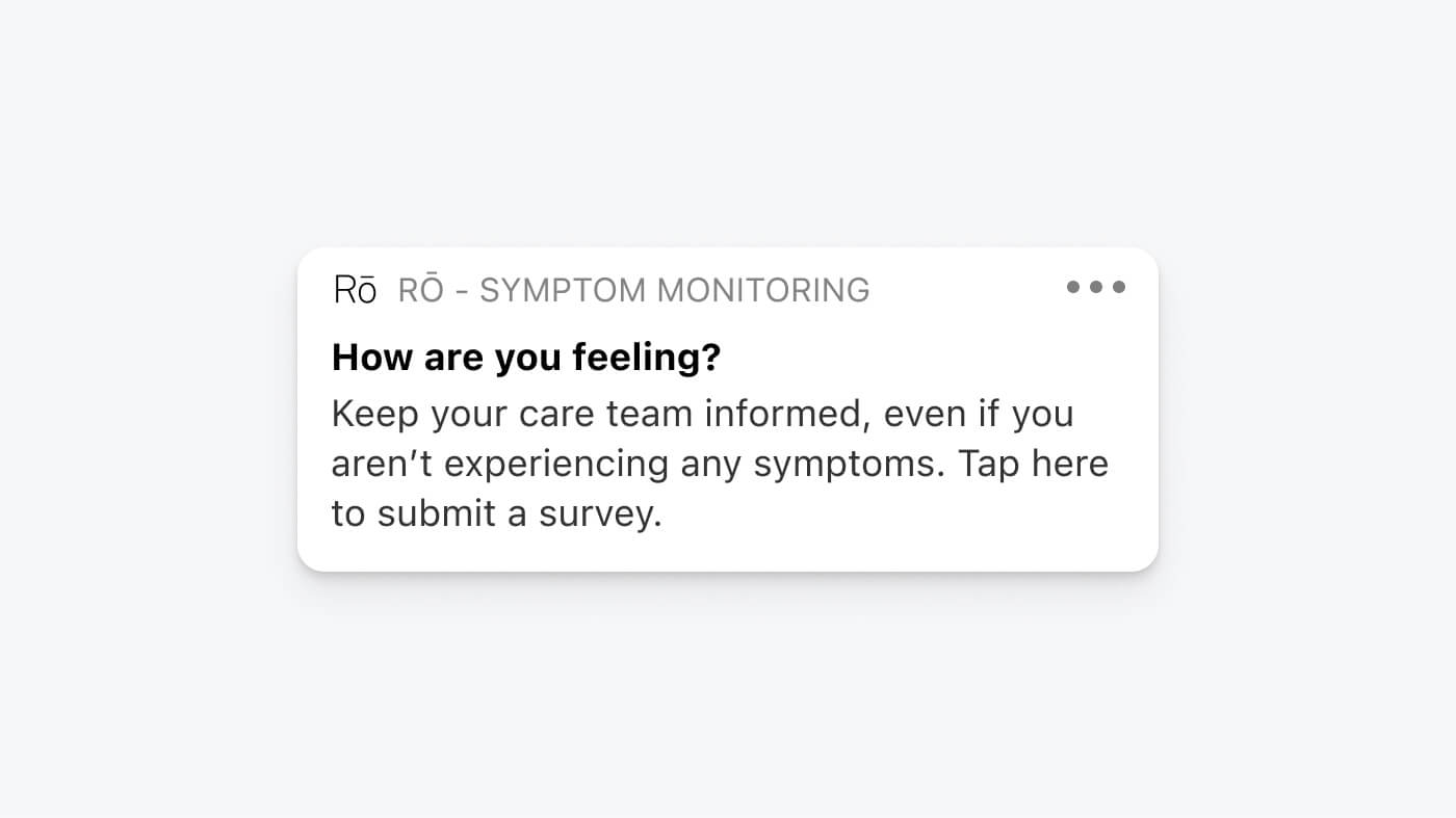
The message headline is clear and succinct, posing the simple question “How are you feeling?” Its body copy clearly expresses the value and urgency of the CTA the company is encouraging—the user’s completion of an in-app survey.
9. Connecting the User Journey
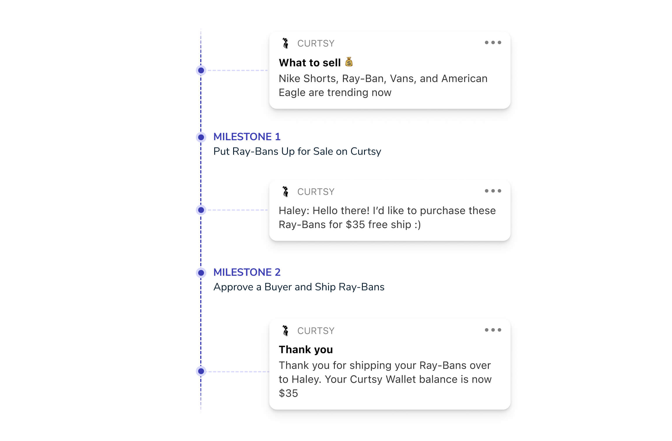
Clothing resale app Curtsy fills a “day-one need” with push notifications to guide their users through a high touch, communication-rich app journey. Given that it takes between 20 and 30 messages for users to complete a single transaction, notification sequences such as these pave the way for an effective app experience.
The first notification in the series helps users understand what products are trending and gives them a suggestion for what they should sell.
The second notification directly includes message copy a user’s received from a buyer on the platform, which shows how the app streamlines communications between buying and selling parties in the app.
The third message in the sequence provides an order delivery confirmation that alerts the user of their new balance in the app. It never hurts to generate excitement by showing a user that their balance has gone up!
10. Onboarding Users
Ogun is a Spanish construction management app designed to provide simple communication and coordination tools for contractors, specialized trades, and renovation professionals.
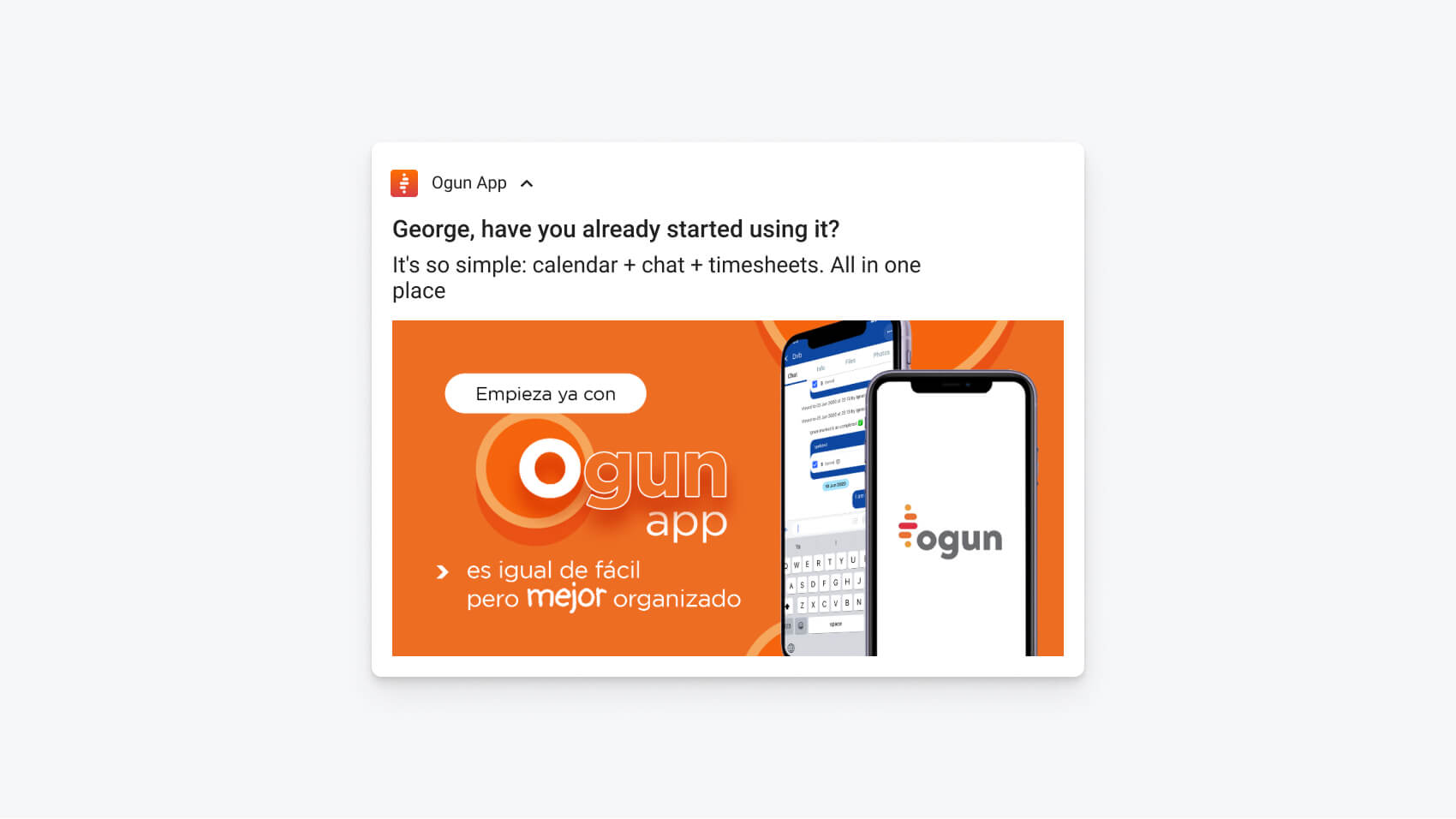
This clear and concise notification facilitates user onboarding with a translated and personalized message asking a user whether they’ve started using the app yet. Sometimes a friendly nudge is necessary to remind a user to come back after first install. This message title is followed by the notification’s body copy, which gives a quick and dirty pitch for why the user needs the platform. Here, the app’s value prop is clearly stated as “calendar plus timesheets plus chats- all in one place.” Finally, it doesn’t hurt that the notification contains a bright orange graphic, which makes it extremely eye-catching. When hooking users, it’s important to remind them exactly what they’re coming back for.
We hope these examples inspire you to step up your push notification game and have fun while doing so!
Get Started with OneSignal
OneSignal is designed to help you send notifications and seamlessly manage your user communication across various channels, including mobile push notifications, web push notifications, bulk SMS, in-app messaging, and email. Our platform is quick to set up and makes it easy to send eye-catching messages without doing any development work. If you don't have a OneSignal account, you can create one for free and start sending push notifications to your users today. Don't take our word for it — simply sign up and see for yourself!
Create a Free Account