2017 was OneSignal's breakout year -- in addition to raising our Series A, we grew from 110,000 to over 300,000 registered developers on the platform, and from delivering 2 Billion messages a week to over 10 Billion.
Our goal is to make 2018 even better than 2017, and first on our list of improvements is to redesign the OneSignal dashboard.
Redesign Goals
Our dashboard UI began a few years ago as a humble bootstrap template1, and in the intervening years OneSignal has become a much more sophisticated product that has outgrown its original UI. Our team has also grown, allowing us to prioritize usability improvements.
After interviewing customers and handling over 75,000 support questions, we identified three main goals we could tackle with a redesign:
-
Improved Navigation - OneSignal will continue to add new features, and typically every time a product adds a feature it gets a bit harder to use. We wanted to avoid this and make it easier to discover and access the most common flows like sending messages, while still supporting more powerful features as we grow.
-
Contextual Knowledge - push notifications and marketing automation introduce many concepts and complex topics that require customer education. We wanted customers to be able to understand these features and concepts while they're directly interacting with the dashboard.
-
Better Forms & Previews - a good portion of the OneSignal dashboard consists of forms, either for configuring platforms or sending messages. We wanted to give customers feedback while they filled out forms, including validating inputs are correct and offering better notification previews.
Improved Navigation
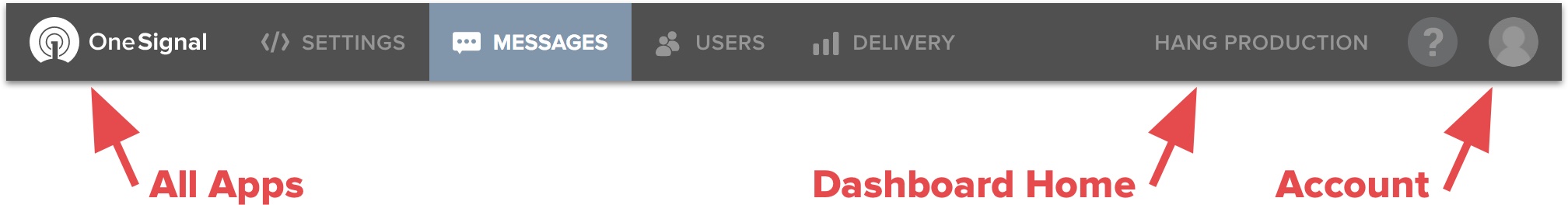
The first thing you'll notice when you log into OneSignal is that we've moved navigation from a sidebar to the top.
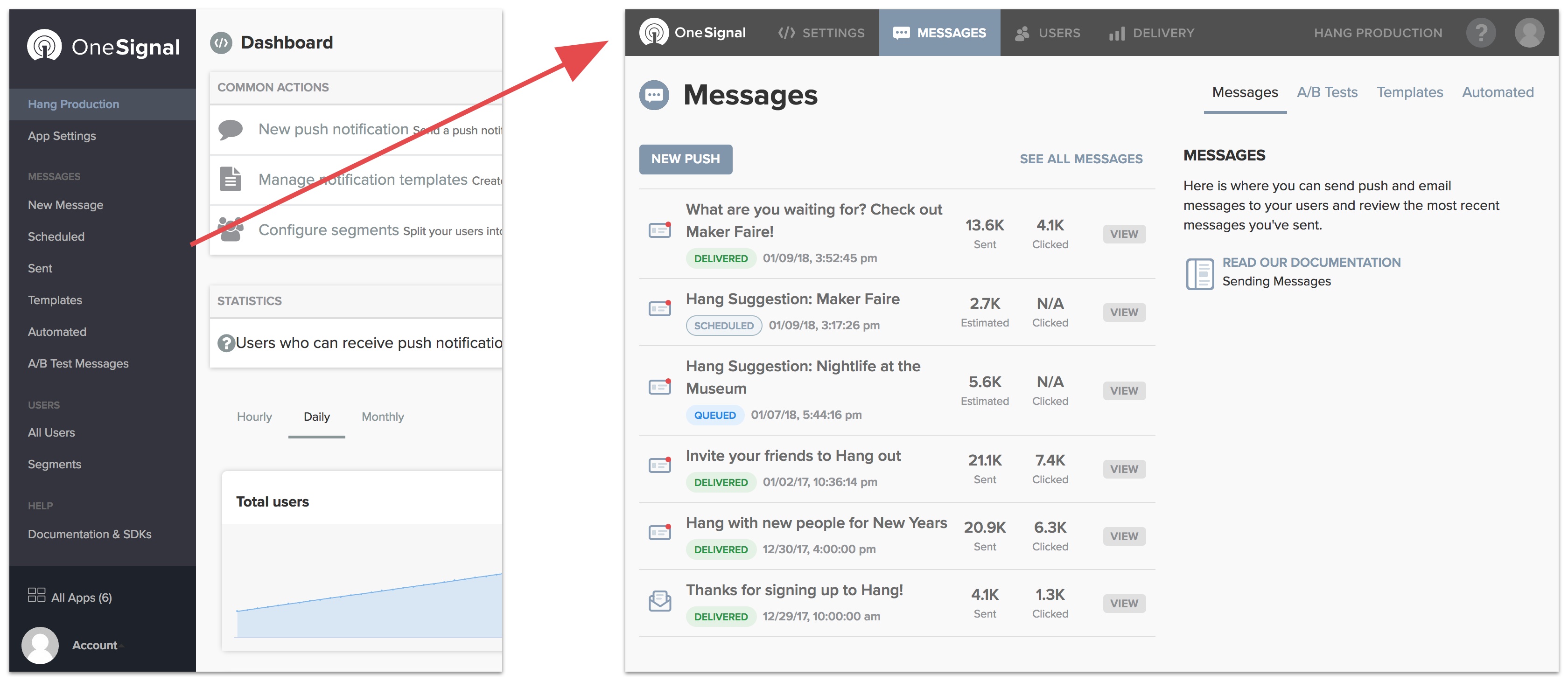
Whereas before, sidebar exposed all our features equally in a list, the new topbar organizes features into four distinct locations:
In addition, you can click the OneSignal logo to navigate you to All Apps, your App's name to take you to the dashboard home, or your profile icon to take you to your account settings.
Each of major section contains several sub-pages, which can be navigated to from the right hand tabbed list. In Messages case, this includes the default Messages page, A/B Tests, Templates, and Automated:
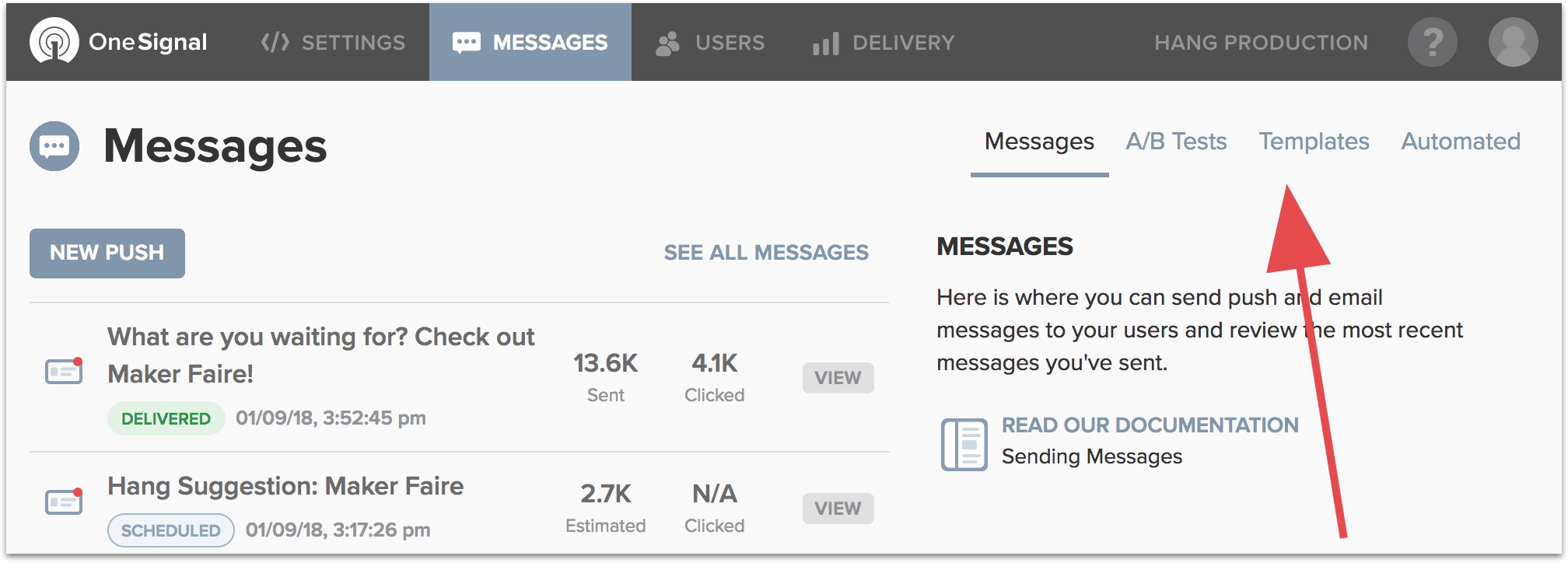
As you can see, the new navigation supports both a simple path (e.g. just sending messages) and a path for customers that want to dive into more powerful features in sub-menus.
Contextual Knowledge
Some of the finer details of push notifications and marketing automation are hardly straightforward. We've spent considerable effort making sure our documentation is comprehensive and up to date. However, to use OneSignal effectively, customers must frequently switch between our dashboard and documentation - a less than ideal experience.
We set out to better merge these two worlds by embedding contextual knowledge and links to relevant documentation throughout the dashboard, in a system we call Tips.
We think Tips are a really big deal because they save time and help customers follow best practices. With relevant information now in the dashboard, customers can spend more time perfecting their push strategy and less time diving into documentation.
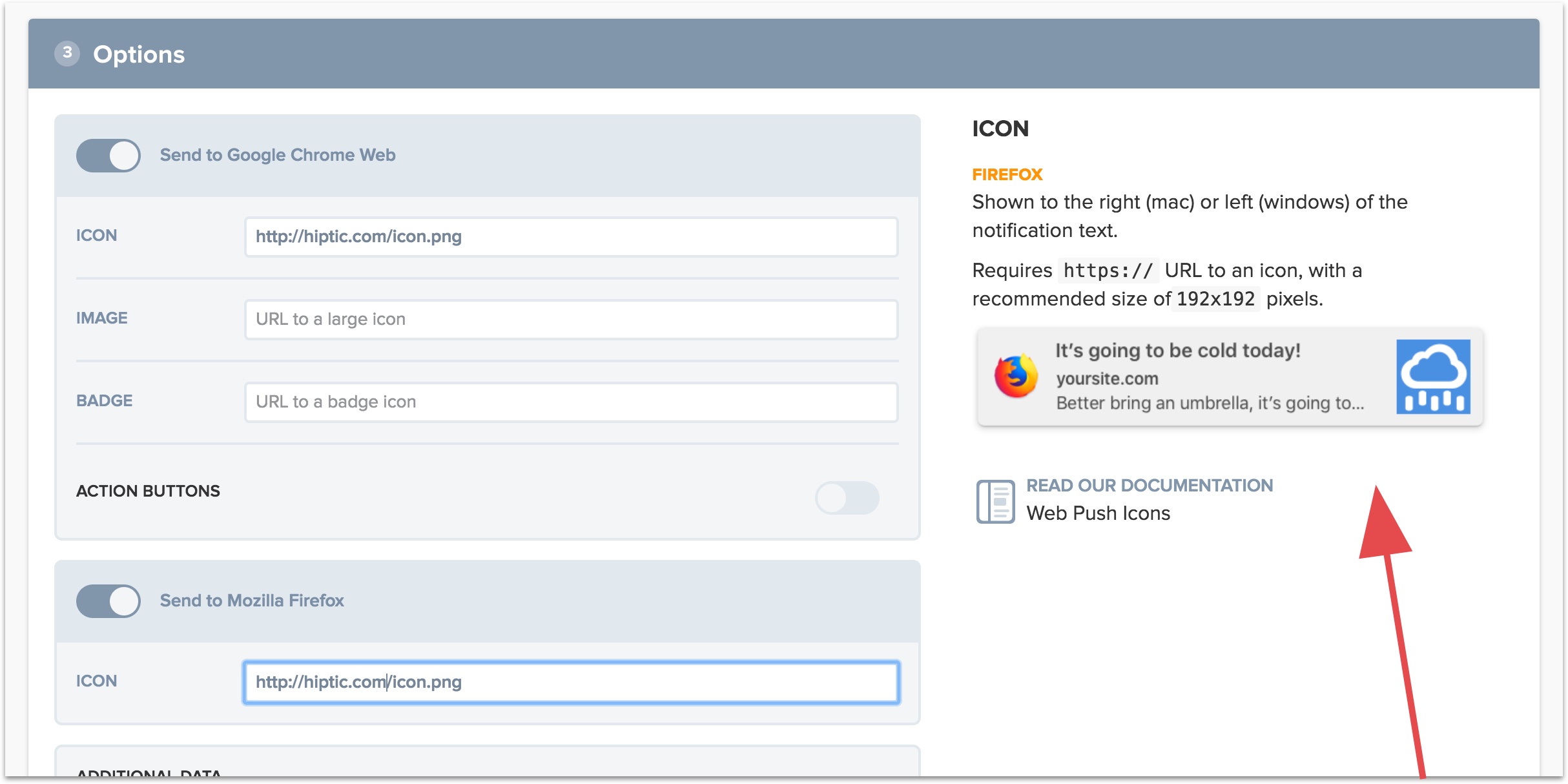
You can access Tips from almost anywhere in the dashboard. On nearly every page you'll see a Tip on the right sidebar explaining a particular part of the app you're in, with links to read more in our documentation.
You can also hover over forms to show relevant tips in more complicated parts of the app, such as the above Options section in the New Message flow. Tips will also show you any platform-specific details to forms (e.g. the Firefox icon's resolution, above).
Better Forms & Previews
Finally, we've put a lot of effort into improving the functionality and feedback given when customers fill out forms like in our New Message flow. These forms are now visually clearer, support different browser widths from mobile devices to widescreen, and provide better feedback when there are errors.
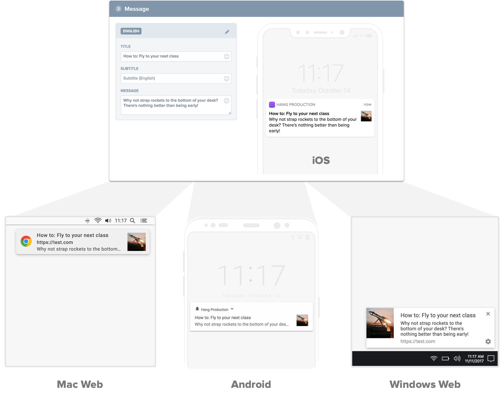
In addition, we've redesigned our notification previews, so what you see looks almost exactly like what you get on both mobile devices and web browsers. With these changes we think we've got the best notification previews in the business.
Other Changes
New Message - we received a lot of feedback from customers that wanted the New Message flow to be simpler, so we've condensed it down to a single page and embedded tips throughout.
Web Push Setup - we also redesigned the setup process for web push which radically simplifies web push setup and no longer requires code.
Documentation - our documentation has undergone a big update, making it easier to find relevant information, examples, and best-practices.
Try it Out
Today's redesign gives us a solid foundation for the features we're planning in 2018 - some of which are coming very soon. We hope you like it! Feel free to reach out and let us know what you think.
1 That bootstrap template was probably the best $25 OneSignal ever spent.