Every mobile OS release is a new opportunity to see where Apple and Google perceive the biggest pain points and opportunities exist in the mobile landscape, and how those perceptions are shaped by their different platform philosophies.
Typically Apple products are optimized for light use and the most common use cases, and progressively get more difficult to use as a user’s workflows becomes more complex. On the other hand, Android’s philosophy is essentially ‘the user is in control’, which works well for more advanced users that like to tweak their experience, but incurs more cognitive overhead and complexity for lighter use.
These philosophical differences are on full display in the latest releases of iOS 11 and Android Oreo, which focused on changing entirely different aspects of notifications.
iOS 11: Lockscreen Changes
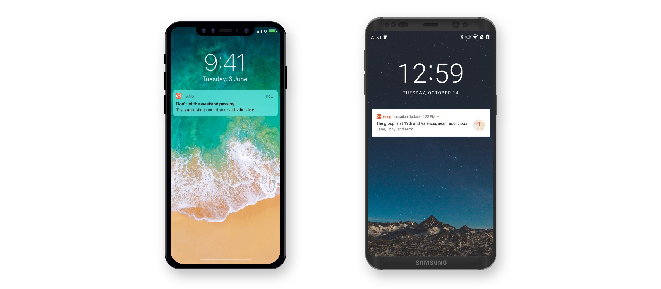
The biggest change to notifications in today's iOS 11 release was the simplification of the lockscreen user experience, combining the lockscreen and the notification shade into a unified panel.
No doubt this change was all but necessitated after removing the home button with the iPhone X. Dieter Bohn at The Verge writes:
But the most fascinating thing about notifications on iOS 11 is that the shade you pull down from the top is the same thing as your lock screen. They look and operate exactly the same: down to swipe over to your camera and to your widget screen. It's one fewer conceptual "Zone" to have to think about, and once you get used to it you'll wonder why it wasn't always that way.
The only other change to note is users may now change how notification previews appear in the lockscreen, a change no doubt driven by Apple's dedication to user privacy. The lockscreen simplification is a solid improvement to the multi-page shades of iOS 10, but aside from notification previews, iOS 11 leaves the interface for managing notifications basically untouched.
Android Oreo: Categories
Meanwhile, in the latest Android release Google made major improvements in notifications by adding Notification Categories, which make managing notifications far easier for users and developers alike (see our blog post for details on these changes).
Most notably, Categories adopt the common pattern of apps letting users manage notifications by type and offer that functionality to every app basically for free (provided, of course, that you use a service like OneSignal that helps you manage categories). This does double duty of improving user experience and saving developers time.
Google also seems to have a growing interest in taking a more active role in handling notifications generated by apps, including potentially spam detection.
The Changing Role of Notifications
It’s these additional capabilities and responsibilities taken on by Google that suggest notifications are one of the areas where Android remains functionally ahead of iOS. However, it's possible that the tech giants actually have fundamentally different philosophies about the purpose and future of notifications, and are thus focused on different ends.
One possible future for notifications is as a queue of action items. Dieter Bohn of The Verge describes this use case and his frustration that iOS 11 doesn't properly support it:
Apple and I have a very serious disagreement about notifications. I want them to be a place where I can quickly triage a ton of things. I want to get an overview of my day and take action on the stuff I care about while swiping away the stuff I don't. I like to manage my notifications, and once they're properly curated I get a ton of utility out of a notification pane. I can see what emails matter, I can respond to texts directly, I can dismiss stuff I don't care about. I basically don't even need the home screen.
At the moment, this queue-of-action-items use case seems far more at home on Android Oreo than on iOS 11, due to features like notification categories.
Meanwhile, with iOS 11 Apple seems content to let the limited capabilities of the lockscreen interface dictate the overall notification load that users feel comfortable with. This is perhaps a subtle suggestion to users that they should grant notifications permissions to fewer apps, or at the very least an unintended consequence. The result is notifications are a heads up for conversations or other things that require attention, but should not be seen as an interface to triage action items.
Our sense is that while this may be the current state of affairs on iOS, this isn't entirely how Apple sees the future of notifications. iOS 11 is notable in that there were big platform and device changes to both iPhone and iPad that meant the iOS team had their hands full on core user experience improvements. We think this meant any serious improvements to notifications were delayed, but we'll have to wait until next year and iOS 12 to know for sure.
In the meantime, customers should stay the course on their messaging strategies, as today's iOS 11 release doesn't much change the iOS notification experience.


