People use all kinds of devices all over the world. Each of these devices might display a notification in a slightly different way.
The last thing you want to do is cobble together a message with an image, blast it to everyone, and have your notification look weird to at least half of your user base. With too many characters in your message or notification title, you risk having it get cut off, which may actually reduce clicks or taps.
This is why we’ve provided a couple of tips to help you make sure your notifications look good on any device you send it to.
Know the Character Limits on Each Type of Device
If you want to send notifications to any type of platform, the best practice is to use as few characters as possible in both the title and the message.
While individual platforms such as Android and web browsers titles can contain up to 50 characters and the message body can contain up to 150, it would be safer to keep your notifications at around 20 characters for the title and 60 characters for the body text.
The number of characters that will actually be displayed on a user’s device depends on a few factors:
- Does it contain an icon? With an icon, there will be less remaining space for text.
- Which characters are used? For example, a “W” can actually take up more space than an “i”, leaving less space for other characters in a message.
- For web-based notifications, does it contain either the “Close” or “Settings” buttons? The presence of these buttons further reduces the remaining available space for text on a web push notification.
Images May Display Differently Than Expected
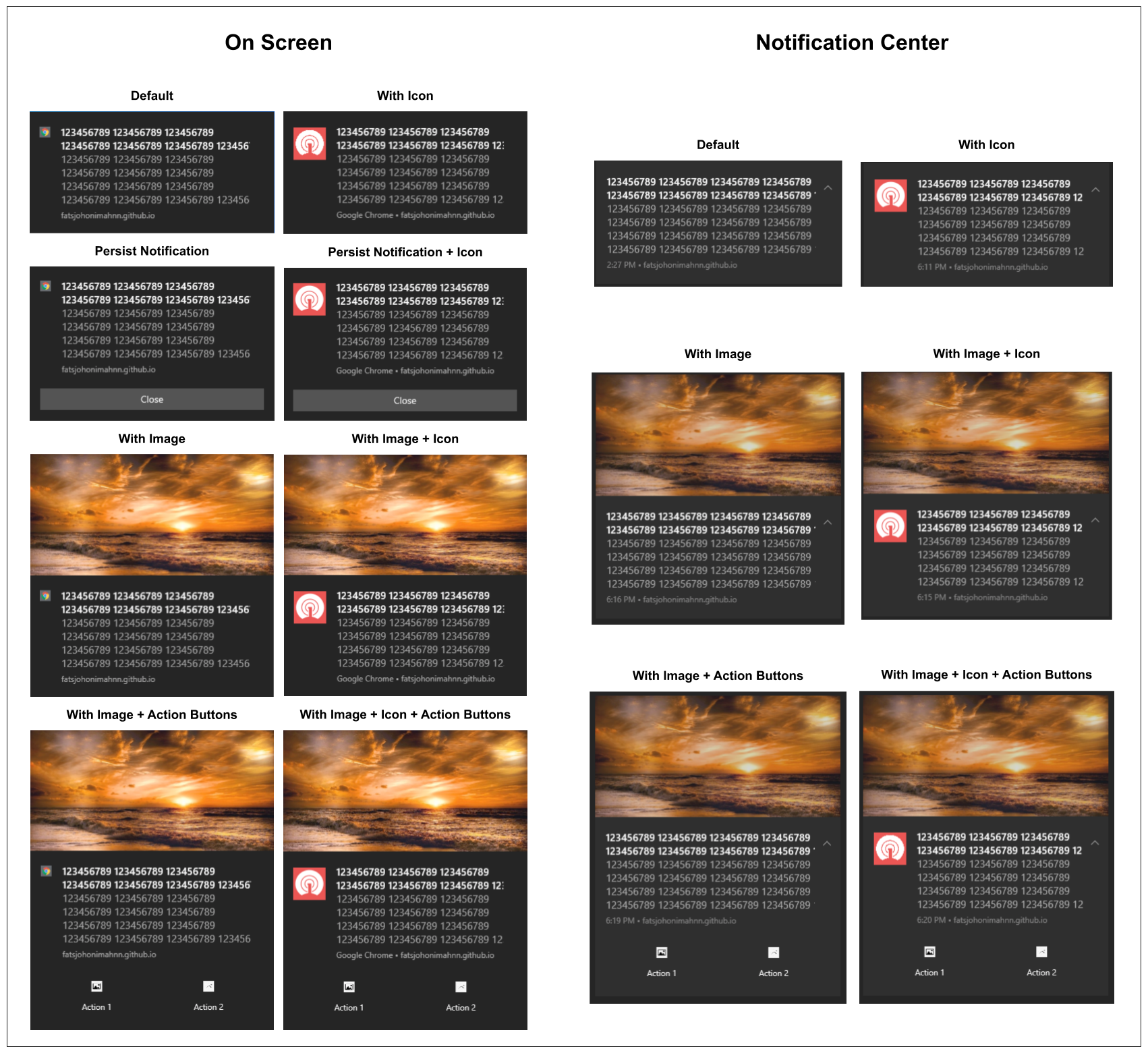
Using images in your notifications can be a little tricky. While JPEG and PNG images will work on all platforms, GIF images only work on Android and iOS devices. Even so, GIF images will not be animated on Android devices. The best practice, in this case, is to typically use JPEG or PNG files.
The resolution of your image depends on the platform you are sending the image to. Each platform has different sizing and aspect ratio requirements. For both web and Android notifications, images with a 2:1 aspect ratio would work best (horizontally-oriented images with a width twice that of its height). For iOS, however, a 1:1 aspect ratio is the best option.
For more details on recommended image sizes and resolutions for each platform, check this table.
With all these different requirements, the best approach is to create an image-based notification for a specific device or platform. If you want to send to both Android and iOS, it’s best to create two different notifications with the same title and message, but with different image sizes and aspect ratios—one for Android and one for iOS.
OneSignal Makes It Easy
Taking into account image sizes, icons, character limits, and differences across platforms, sending notifications that look good to all users may seem like a daunting task.
Luckily, OneSignal’s notification preview tool makes it easy to send easy-to-read notifications, thus increasing user engagement.
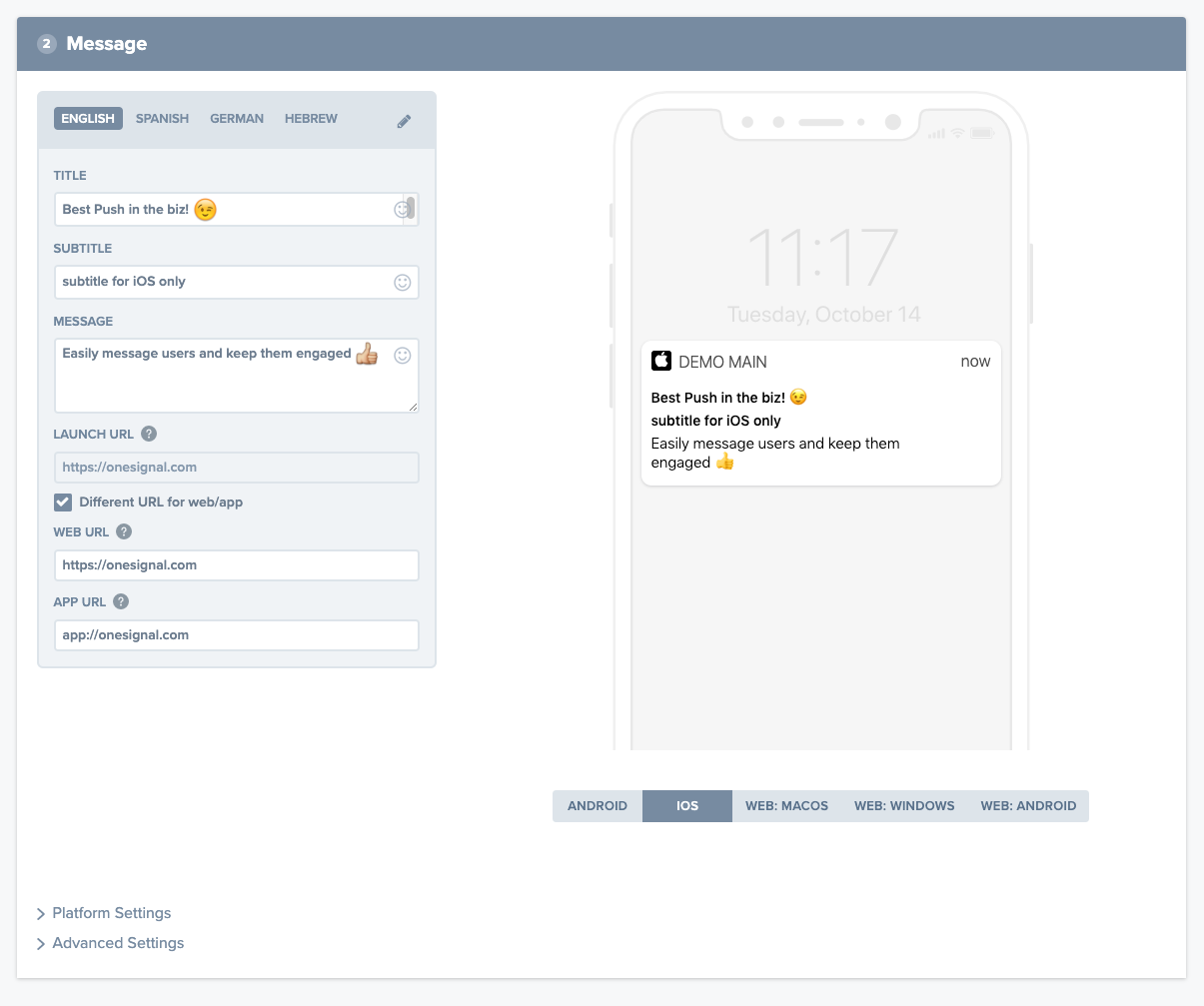
OneSignal removes all the guesswork and eliminates the painstaking process of testing notifications on different devices. Using our preview tool, you’ll know what a notification will look like on different devices before you send it to anyone.
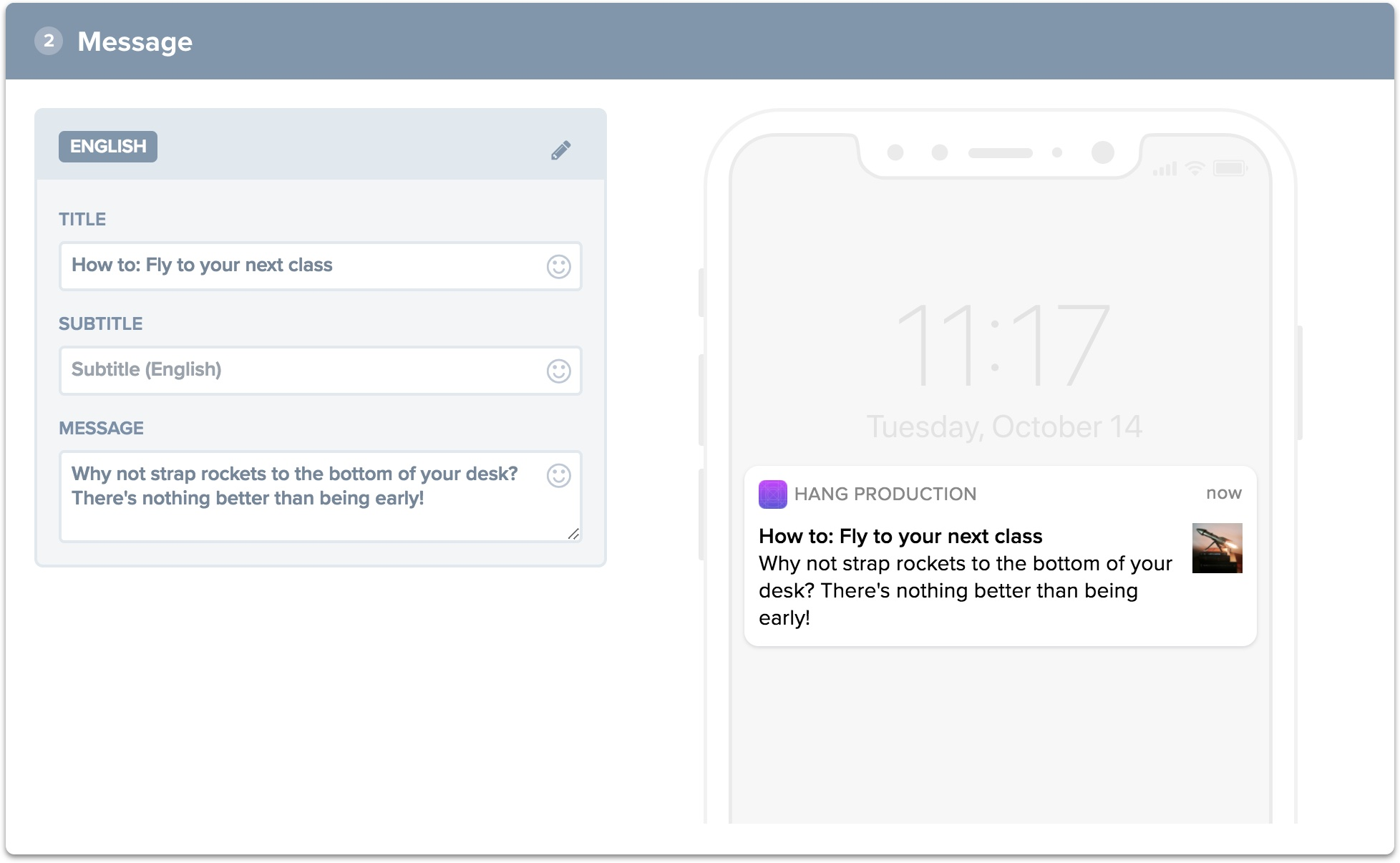
When you create a new notification under New Message, you will see a notification preview tool on the right pane. From there you can select the type of web or mobile-based platform (Mac OS, Windows, and Android).
For further information, go to our full documentation on character limits, image resolutions and aspect ratios for each platform.