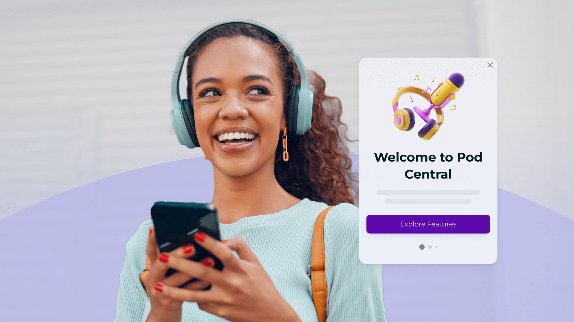
In the ever-evolving landscape of user engagement, standing out in a crowded inbox or notification center requires more than just clever copy. Visuals play a crucial role in capturing attention and driving engagement across various messaging channels. This blog post delves into the best practices and tips for creating and using visuals specifically in push notifications, SMS, email, in-app messages, and iOS Live Activities.
The Power of Visuals in Messaging
Visual content can significantly enhance user engagement. Messages with visuals are more likely to be read and remembered compared to text-only messages. Visuals can convey emotions, illustrate ideas, communicate tone, and prompt actions faster than words alone.
Push Notifications
Push notifications are a powerful tool for re-engaging users, but they must be compelling to avoid being swiped away. Here's how visuals can make a difference:
Best Practices:
- High-Quality Images: Use high-resolution images relevant to the message. For example, a travel app might use a stunning image of a beach destination when promoting holiday deals.
- Personalization: Incorporate personalized visuals that cater to the user's preferences or past behavior. For instance, Shake Shack might send you a notification with an image of the shake you purchased the last time you visited.
- Brand Consistency: Ensure that the visuals align with your brand's aesthetics. Starbucks, for instance, consistently uses its iconic green and white palette in its notifications.
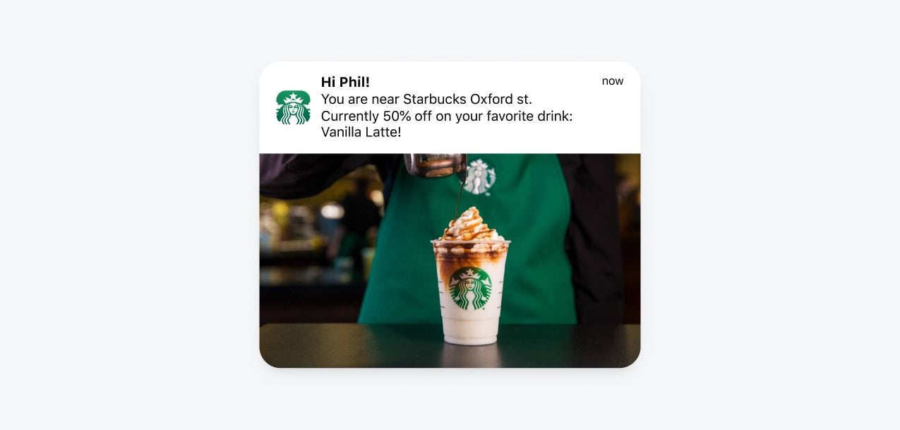
Tips:
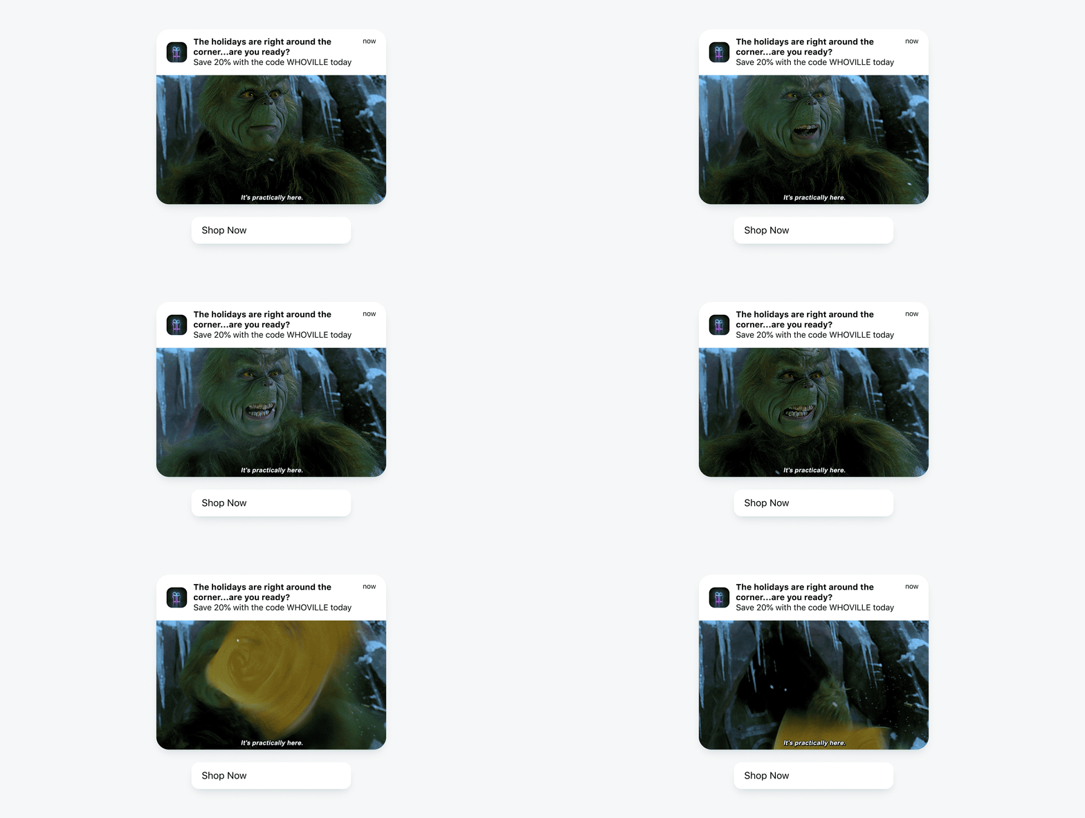
- Animated GIFs: Capture attention with movement and convey more information and tone in a short span. For instance, this holiday gif adds personality and humor to this notification while also underlining the urgency of shopping now.
- Emojis: Adding emojis can make your notification more relatable and expressive. For example, a food delivery app could use a pizza emoji to grab attention when promoting discounts on pizza orders.
SMS
SMS is often limited by character count, making it crucial to convey messages succinctly. However, visuals can still play a role:
Best Practices:
- Link to Visual Content: Include a link to a visually rich landing page. A fashion retailer might send a link to a lookbook featuring the latest collection.
- Clear Call-to-Action (CTA): Ensure the CTA is prominent and directs users to the visual content, e.g., "Check out our summer sale! Click here to view."
Tips:
- MMS (Multimedia Messaging Service): Send images, videos, or audio files directly to users. For instance, a car dealership might send an MMS with a video showcasing the features of a new model.
- Shortened URLs: Use URL shorteners to keep the message concise and trackable, e.g., "See our new arrivals: bit.ly/new-arrivals."
Email remains a versatile and widely used channel for communication. Here’s how to effectively incorporate visuals:
Best Practices:
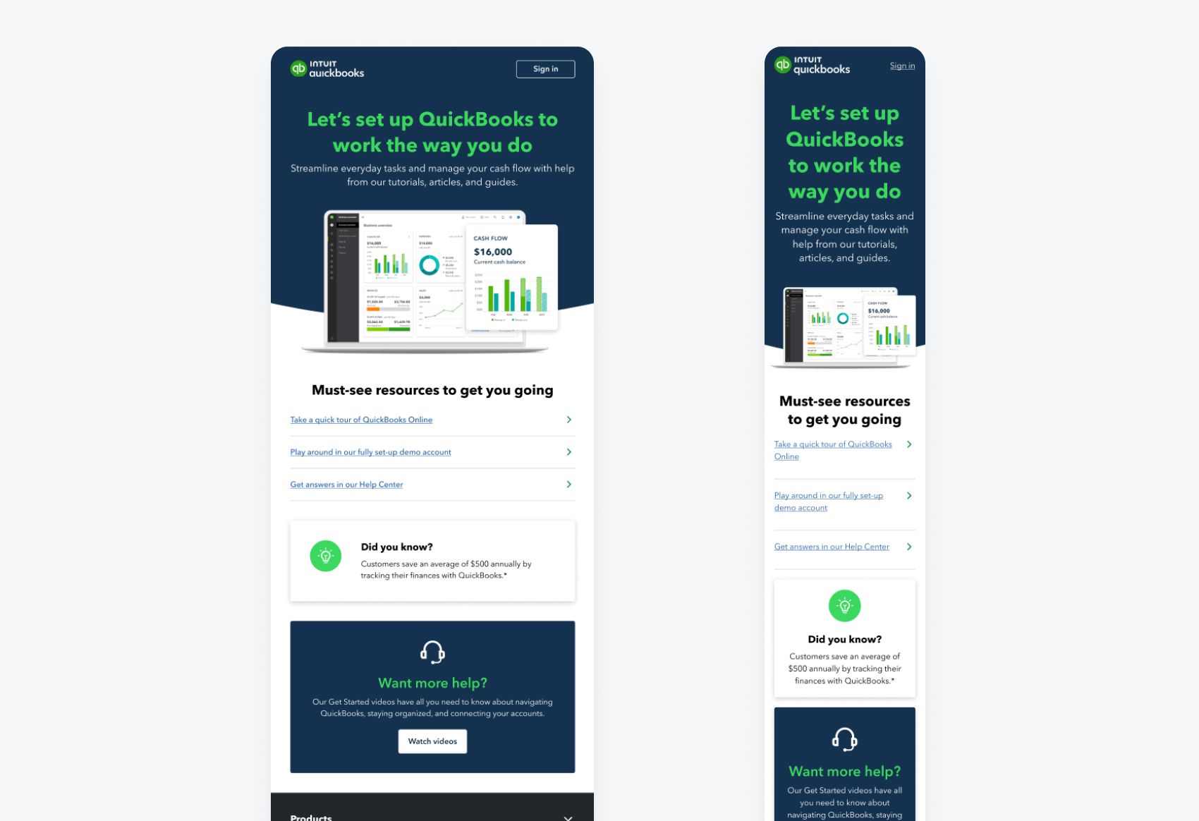
- Responsive Design: Ensure that your visuals are optimized for both desktop and mobile devices. An email with captivating visuals should look great on any screen size.
- Alt Text: Always include alt text for images. This is crucial for accessibility and for cases where images fail to load, e.g., "Image of a beach resort at sunset."
- Balance Text and Visuals: Maintain a balance to ensure readability. A marketing email for a software company might include screenshots of the product along with concise descriptions.
Tips:
- Infographics: Present data and statistics in a visually appealing way. An email from a financial service could include an infographic about market trends.
- Animated Elements: Subtle animations can draw attention to key areas. An eCommerce email might have an animated "Shop Now" button to encourage clicks.
In-App Messages
In-app messages are seen by users who are actively engaging with your app, providing a unique opportunity to use visuals effectively:
Best Practices:
- Contextual Relevance: Ensure that the visuals are relevant to the user’s current activity within the app. A fitness app might show a congratulatory image after a user completes a workout.
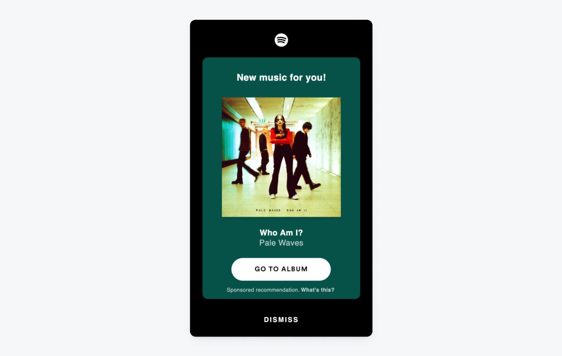
- Non-Intrusive: Visuals should enhance the message without disrupting the user experience. A music streaming app could use a subtle pop-up with an image promoting a new album release.
Tips:
- Dynamic Content: Use dynamic visuals that change based on user behavior or preferences. A news app might display images related to topics the user frequently reads about.
- Interactive Elements: Incorporate interactive visuals, such as buttons or sliders. A gaming app might use an interactive slider to showcase different character skins.
iOS Live Activities
iOS Live Activities provide real-time updates on the lock screen, making it essential to use visuals that are both informative and engaging:
Best Practices:
- Simplicity: Use clear and simple visuals that can be easily understood at a glance. A food delivery app might show a live progress bar indicating the delivery status.
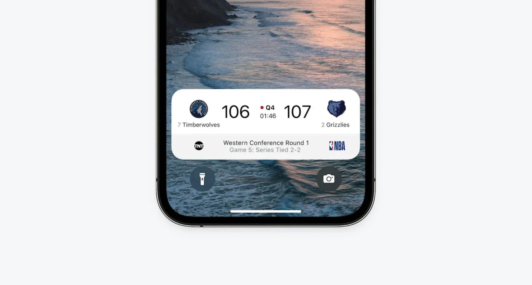
- Consistent Updates: Ensure that the visuals update in real-time to provide accurate information. A sports app might use live score updates with team logos and score changes.
Tips:
- Progress Indicators: Use visual indicators to show progress or status updates. A ride-sharing app could display the driver’s real-time location with a moving icon on the map.
- Rich Media: Incorporate rich media, such as live images or short videos. An event app might show a live feed of a concert on the lock screen.
Using visuals in messaging is not just about aesthetics; it’s about enhancing the user experience and driving engagement. By following these best practices and tips, you can create compelling visuals for push notifications, SMS, email, in-app messages, and iOS Live Activities. Remember, the key is to ensure that your visuals are high-quality, relevant, and aligned with your brand's identity.
