Learn how our new Design Engineer, Charles Kantz, adapted our website color palette to improve accessibility, enhance our UI, and create a more cohesive brand aesthetic.
As a newly-hired Design Engineer for OneSignal, I wanted to hit the ground running, so I focused on interface fixes that would be the most impactful. I ran a full interface audit of the OneSignal website that included looking into component and design token usage across the interface. This helped me determine where updates or fixes would be the most impactful, based on the frequency of usage. Through this effort, I discovered accessibility concerns around some swatches in the gray palette, particularly around the contrast, that warranted a deeper investigation.
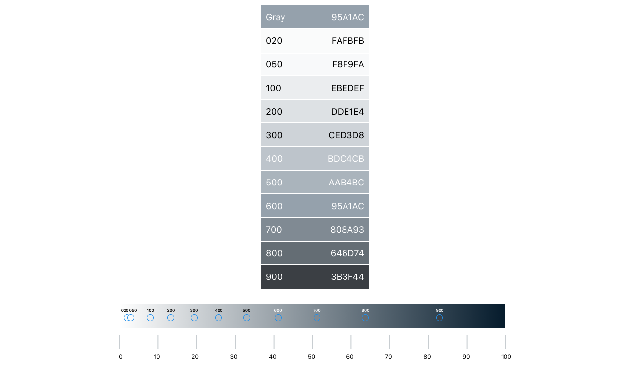
Any established design system will include a color system. OneSignal's Beam design system contains a set of base colors with corresponding light and dark variants for each color, similar to Material design colors. The range of values extends from 50 to 900, with lower numbers representing lighter tints.
Too Many Grays!
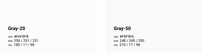
Our gray palette followed this pattern with one exception: the palette also contained a “Gray-20” color. This color lived between our Gray-50 and pure white, and the visual difference between Gray-20 and its neighbors was relatively low. When converting each value to HSL, it revealed that Gray-20 was the same brightness as Gray-50 (the L in HSL). Gray-50’s HSL was 210/17/98, and Gray-20 was 180/11/98, meaning only the hue and saturation differed.
It was clear that this color was providing little value, but why did it exist? I looked into its usage in the codebase to find that out. I learned that this color was only used for a single component, which was good news. The component that utilized Gray-20 was our core card component. When I reviewed the design of this component, it became clear why it used this color.
Component Design Refactoring
OneSignal's UI starts with our off-white background color, our Gray-50. The card component sits on the background with a minor drop shadow for depth. Each card component had a header bar, and the background color of that bar was the dreaded Gray-20 — but why? The intent was to emphasize the header for the card, but without introducing color. In terms of color options for the bar, Gray-50 is the page background, and Gray-100 (the next option) did not have a pleasing aesthetic. The resulting solution was to create a new gray between white and Gray-50, hence Gray-20.
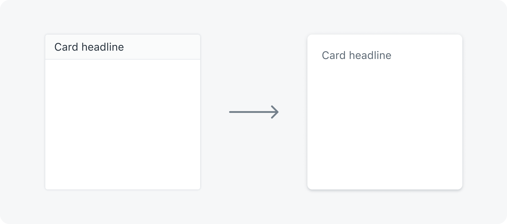
After consulting with the rest of the design team, we agreed on a new design for our card component. We took out the off-white background from the header and added some vertical padding on the heading to add emphasis. That update allowed me to remove Gray-20 from the design system, which felt great! With that color gone, I was free to look at refining the rest of the gray palette.
Palette Analysis
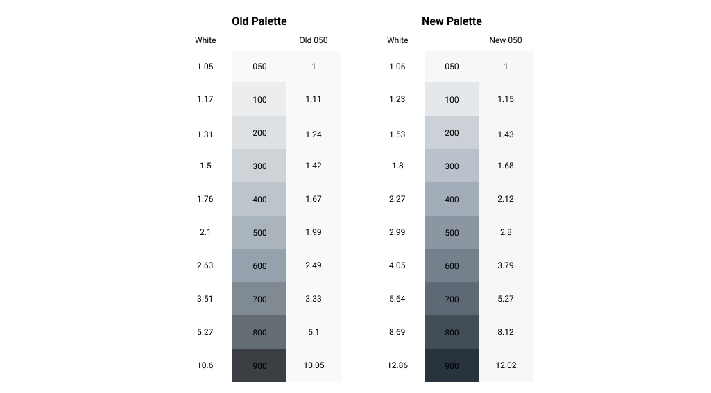
When we visualized the gray palette and plotted the values on a graph, we started to see some improvement opportunities within the values.
First, we saw some wavering in the hue value across the palette. Ideally, this value is consistent or shifting consistently across the palette to ensure the tints and shades feel cohesive. Second, there was a similar wavering in the saturation values, which also desires a consistent value but has some leeway. The most important is the light curve. While the progress of it appears more or less natural, it does have a bit of a convex shape to it. This means we’ll see more drastic jumps in darkness towards the dark end of the palette, and the light/middle swatches more closely related. This had the unintentional result of making components with multiple grays feel washed out and insignificant due to the lower contrast.
From a brand and visual design standpoint, it’s not ideal to have grays without any saturation. Whenever possible, you want your grays to lean into either the warm or cool tones, but only slightly. OneSignal’s primary brand color is purple, and the primary interactions in our interface are purple, so it made sense to have our grays take on a little cool tone to compliment the primary brand and UI colors.
From a brand/visual design standpoint, it’s not ideal to have grays without any saturation. Whenever possible, you want your grays to lean into either the warm or cool tones, but only slightly.
After my analysis of our grays, I defined two goals for refining our gray palette:
- Increase contrast on components with light gray backgrounds and dark gray text, to improve accessibility and visual quality.
- Normalize and subtly shift the hue on our grays to be in the cool tone range, so that the palette feels more uniform and consistent with our OneSignal Black.
Refining the Color Palette
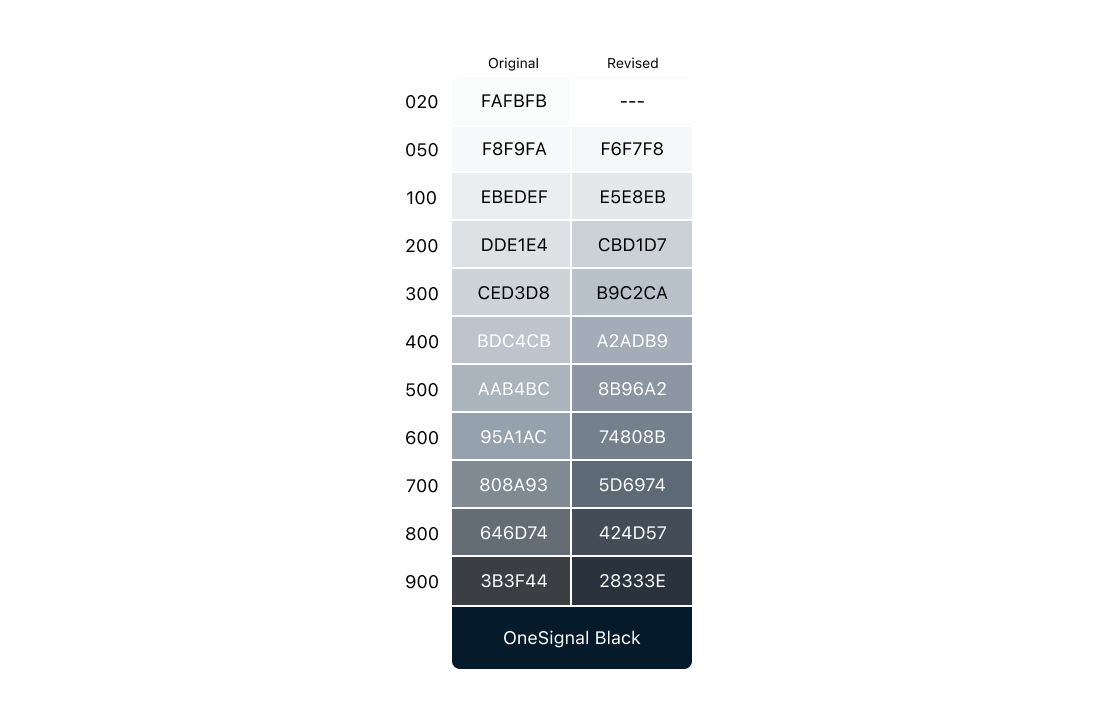
I settled on a hue value and made that consistent across the palette. I then looked at the light value. Our app visual design utilizes light mode only, so our palette needed to be optimized for a light UI. To improve contrast, the values for lighter grays were adjusted to have more “space” between them, to better see the gradations in lightness.
You might notice a slight increase in saturation in the darker values (800 and 900). This was done to better connect the gray palette with the darkest gray, also known as black. OneSignal uses a custom black that is saturated with a cooler tone. When bookending the gray palette with white and OneSignal black, we wanted to see a natural transition from the darker grays into the black, and this increase in saturation helped achieve that.
A Note on Website Design Accessibility
You may have noticed that my goals did not include any a11y-focused requirements, such as WCAG AA contrast for graphical objects. Creating an accessible website and interface is essential, however, for the time being, the team chose not to adhere to this rule for this project. We have many interactions that do not use our gray palette, so it felt best to approach color accessibility holistically to ensure any updated visual design is cohesive.
The Outcome
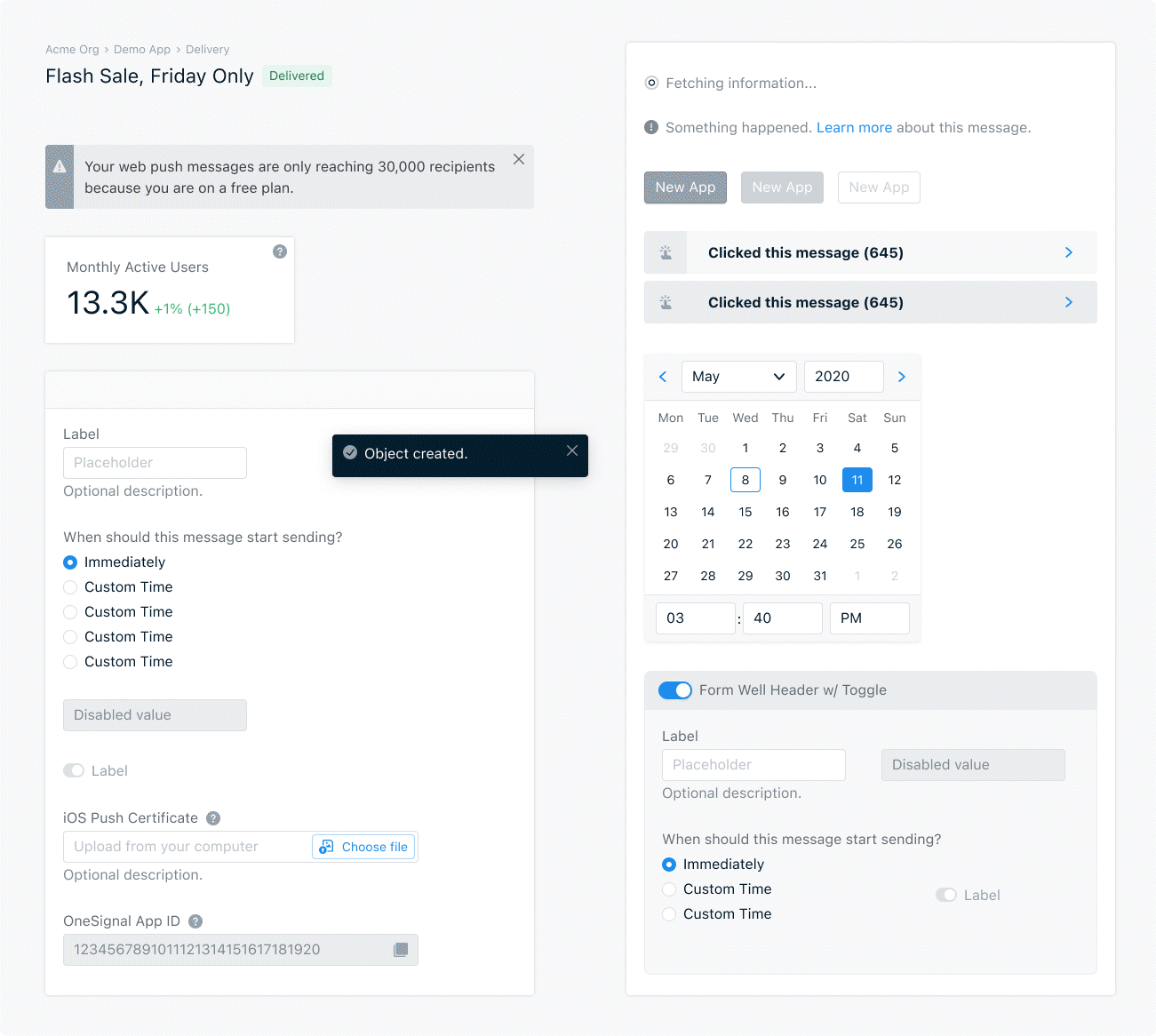
The result to the interface is somewhat subtle but very nice – all elements have increased contrast, we reduced a bit of cognitive load by removing the Gray-20 and accompanying card design, and the increased contrast improves text readability on all non-black text.
OneSignal is Hiring!
OneSignal and our design team are growing! We are hiring designers and Design Engineers. Click the button below to learn about joining our talented team.
View Job Openings